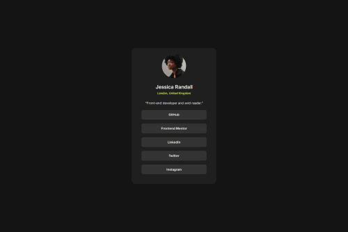
Not Found
Not Found
Not Found
Not Found
Not Found
Not Found
Not Found
Not Found
Not Found
Not Found
Not Found
Not Found
Not Found
Not Found
Not Found
Not Found
Not Found
Not Found
Not Found
Not Found

Submitted

Social links profile using flexbox

P
biwwabong 120

@biwwabong

Desktop design screenshot for the Social links profile coding challenge

This is a solution for...

  • HTML
  • CSS
1newbie
View challenge

Design comparison


SolutionDesign

Solution retrospective


What are you most proud of, and what would you do differently next time?

The speed at which I completed this. That being said there are still a few issues

What challenges did you encounter, and how did you overcome them?

I had trouble getting the buttons to be responsive. Not sure I found the best solution, feels like a clumsy way to do it. I had to expand the width of every element to 100% that contained the buttons to get them to work correctly.

Community feedback

@TedJenkler

Posted

Hi @biwwabong,

Nice project! Here are a few suggestions:

Simplifying HTML: You don’t really need to use <li> tags in certain cases, as they can make your code unnecessarily nested. In CSS, simpler and less code is generally better, with some exceptions.

OG Meta Tags: Given the shareable nature of this project, consider adding OG meta tags to create beautiful, shareable links and improve SEO.

Using target="_blank": Practice using target="_blank" to make links open in a new tab, which is best practice for most links to avoid removing the user from your site.

Keep up the great work!

Best, Teodor

Marked as helpful

1
P
edpau 240

@edpau

Posted

I think setting the ul width 100% is good, it is simple. As long as the container (the card) is responsive, the ul will be responsive, as it always takes all the width of its container.

I would use text-align to center the text in each li and not set each li and a width to 100%. https://codepen.io/edpau/pen/wvLYmwv

In my solution for responsive design, I set my card width to 90vw in mobile, and set a max-width with media query (min-width: 400px) to stop the card grow too large. The button's width will grow with the card width.

Marked as helpful

1

Please log in to post a comment

Log in with GitHub
Discord logo

Join our Discord community

Join thousands of Frontend Mentor community members taking the challenges, sharing resources, helping each other, and chatting about all things front-end!

Join our Discord