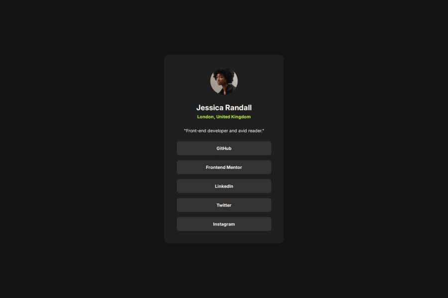
Design comparison
Solution retrospective
I am learning frontend development and aiming to work as one eventually. I would greatly appreciate any tips and feedback!
I worked on improving my approach based on feedback on my previous challenge, and guidelines from reading online. This time round, I approached the challenge by:
- Using CSS reset
- Taking care to write semantic HTML
- Using BEM naming convention
- Naming components for better selector intent
- Taking mobile-first approach
- Using
remfor media queries
I have not styled focus states before this and I nearly missed that out. Next time, I will take note of this for keyboard interactions.
What challenges did you encounter, and how did you overcome them?I faced challenges when trying to style the links to look like buttons, as the box sizes were hugging the text. What I had to do, since they are contained inside a flex container with flex-direction: column, was simply to add the property align-self: stretch to the links.
Another challenge I encountered was that there are no bottom/right padding when the card height/width is greater than viewport height/width. I was not able to resolve this.
What specific areas of your project would you like help with?-
Why does
bodynot have bottom padding when the viewport height is smaller than the card height? Similarly for right padding with viewport width and card width. -
In the Figma file, the transition/interaction has 'Animation' (set to Dissolve) and 'Curve' (set to Slow) settings. Are there any resource/references on how to translate these to CSS?
-
I would love to receive feedback on any good practices to have, and improvements that I can make.
Community feedback
Please log in to post a comment
Log in with GitHubJoin our Discord community
Join thousands of Frontend Mentor community members taking the challenges, sharing resources, helping each other, and chatting about all things front-end!
Join our Discord
