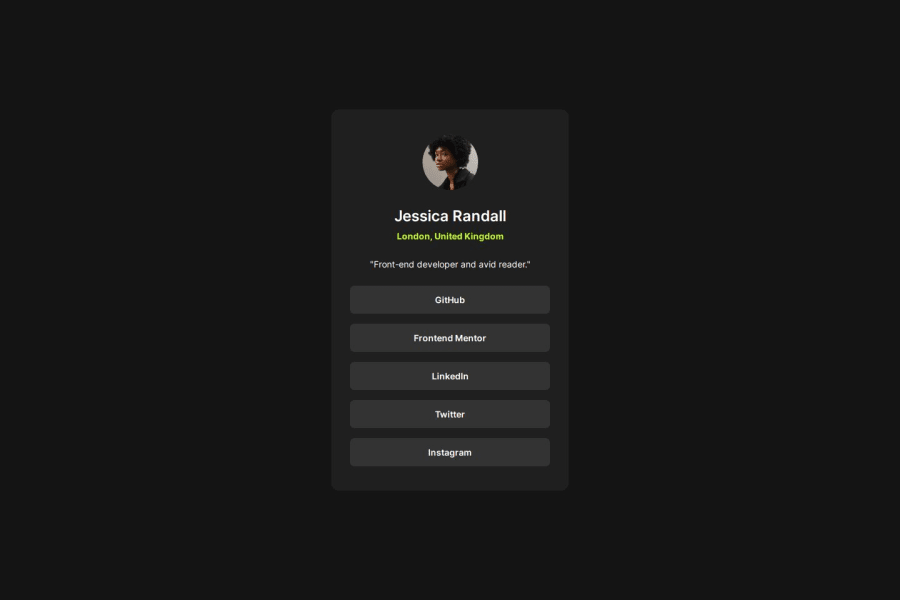
Social Links Profile Using Flex Box. Desktop First Approach.
Design comparison
Solution retrospective
That I managed to implement transitions for the hover effect for the first time.
transition: color 0.5s ease-in-out;
transition: background-color 0.5s ease-in-out;
-Done without the Figma Files
-I used Flex Box to center the different elements. When it came to the elements in the card, or link profile, I used:
flex-direction: column;
justify-content: space-between;
align-items: center;
Setting justify-content: space-between; made it difficult to get the spacing right between the different elements. So I removed this line and added margin-top: to the different elements and was able to come close to what it was supposed to look like.
Is there a way I could have kept justify-content: space-between and then adjusted the margins?
My original thought was to use the justify-content: space-between property to ensure that the picture was at the top of the card and the actual links (I grouped these together in a div) at the bottom and to then adjust the other spaces. I ended up playing around with margin-top set to negative values which seemed odd which is why I ended up the the approach I explained above.
-Basic HTML layout was
-Basic CSS
.linksProfile {
    display: flex;
    flex-direction: column;
    /* justify-content: space-between; */
    align-items: center;
    padding: 40px 30px 39px 30px;
}
I ended up commenting out justify-content because that seemed to be what made it impossible for me to get the remaining spaces between the elements right.
Then I started adding margin-top to the individual elements until I came close to the layout.
Community feedback
- @ashensaviPosted 12 months ago
Your output is so accurate. Since you've mentioned the 'justify content : space-between;'; I used space-around property. here's my code:
.social-link-component-bottom { flex: 1; display: flex; flex-direction: column; justify-content: space-around; align-items: center; padding-bottom: 15px;
}
Btw, The transition thing is cool! I should've tried that.
0
Please log in to post a comment
Log in with GitHubJoin our Discord community
Join thousands of Frontend Mentor community members taking the challenges, sharing resources, helping each other, and chatting about all things front-end!
Join our Discord
