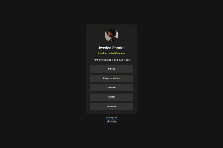
Design comparison
SolutionDesign
Solution retrospective
What are you most proud of, and what would you do differently next time?
Proud about the fact that using flexbox felt natural to me. Next time I might personalize this page with my info :)
What challenges did you encounter, and how did you overcome them?Getting the links section was a bit of a challenge. I knew I wanted to use flexbox, but it took me some time to make it work.
What specific areas of your project would you like help with?In figma, when looking at the height of the object it is sometimes writted as 'Hug' - I am using an explicit height atm - wonder if I need to use anything else ?
Also, if anyone can look at the links section where I used unordered list with anchors - could I do it in a more elegant way ?
Community feedback
Please log in to post a comment
Log in with GitHubJoin our Discord community
Join thousands of Frontend Mentor community members taking the challenges, sharing resources, helping each other, and chatting about all things front-end!
Join our Discord
