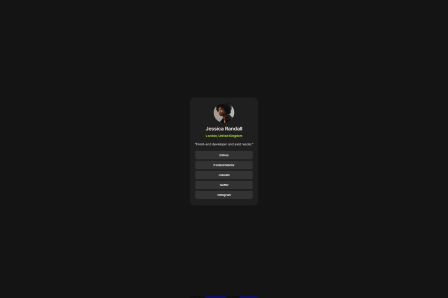


Design comparison

Solution retrospective
I think I still need help in the part of being able to specify the size of the container well and that it is responsive, I already use REM but I think I still don't fully understand it.
Community feedback
- P@kodan96Posted 10 months ago
hi there! ✌️
Couple of tips:
HTML:
- all HTML document should include one h1 element (but not two or three. only one)
CSS:
- basically you don't need to specify the width of your elements. containers will adapt to their content by default. you can use
max-widthto determine the maximum width of your element. you can even combine it withwidth:
.element {
  width: 90%;
  max-width: 40ch;
}
in this case the element will take up 90% of its container's width, but when it reaches 40ch it won't expand above that.
- you're still mixing pixels and relative units, get used to using relative units all around your CSS, especially don't use pixels for the font size.
Hope this was helpful 🙏
Good luck and happy coding! 💪
Marked as helpful1@AlexSG29Posted 10 months ago@kodan96 Thank you very much for the feedback, I am still learning how to use the rem, I understand that it adapts according to the size of the screen.
html { font-size: 16px; /* 1rem = 16px */ }body { font-size: 1rem; /* 16px */ margin: 2rem; /* 32px */ }I certainly hope that future designs have better management of dimensions
1P@kodan96Posted 10 months ago@AlexSG29
You're right with the math, but there's no need to apply that font-size to the html tag, 16px is the default font size in browsers. apply font-size to the html tag only if you want to modify the default.
and no, rem won't adapt to the screen size. only if you modify the font-size property in your
@mediaqueries. if you want dynamic typography, that's actually adapts to the screen size automatically you need to use theclamp()CSS functionMarked as helpful0

Please log in to post a comment
Log in with GitHub
Join our Discord community
Join thousands of Frontend Mentor community members taking the challenges, sharing resources, helping each other, and chatting about all things front-end!
Join our Discord