Not Found
Not Found
Not Found
Not Found
Not Found
Not Found
Not Found
Not Found
Not Found
Not Found
Not Found
Not Found
Not Found
Not Found
Not Found
Not Found
Not Found
Not Found
Not Found
Not Found

Submitted

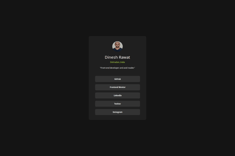
Social-links-profile using CSS Grid

@rawatdinesh10

Desktop design screenshot for the Social links profile coding challenge

This is a solution for...

  • HTML
  • CSS
1newbie
View challenge

Design comparison


SolutionDesign

Solution retrospective


What are you most proud of, and what would you do differently next time?

I learned about CSS Grid which I'm most proud of. I learne about Grid properties and used them in the challenge. I learned anout Meta viewport tag and its directives which help to build responsive web design. I learned a bit about Media queries but did'nt feel comfortable to use in the challenge. Next time I would use CSS framework bootstrap to build the projects which is based on Grid layout. I would use Media queries to build responsive page. I would learn more about CSS Grid and use it comfortably in the challenges.

What challenges did you encounter, and how did you overcome them?

I didn.t know anything about CSS Grid before doing the challenge, so I went through some tutorial and reading guide to know about it. Then I had issues using CSS Grid properties like where and when to use them, how to use them. But then I kept on learning about it and used many properties in the challenge to see the output. Then I got more comfortable with Grid. I had one major issue of centering the Grid on the page, which then I refered to Discord community for help. where people helped me to resolve the issue of centering the Grid.

What specific areas of your project would you like help with?

I need help on CSS Grid properties which I have used on body element. Please help me to learn more about CSS Grid. I want to know whether CSS Grid properties are used on parent (body) element or the Grid container element? I used them on grid container but in discord help, they told me to use them on parent element. But I have seen using Grid properties like display:Grid, justify, align etc. used on Grid container too. So please let me know where should we use Grid properties?

Community feedback

P
Steven Stroud 4,100

@Stroudy

Posted

Amazing job with this! You’re making fantastic progress. Here are some small tweaks that might take your solution to the next level…

  • Using a <main> tag inside the <body> of your HTML is a best practice because it clearly identifies the main content of your page. This helps with accessibility and improves how search engines understand your content.

  • Your heading elements <h1><h6>Missing 2 3 4 5, Heading elements should be in sequentially-descending order (e.g., <h1>, <h2>, <h3>) to create a clear content structure, improving accessibility and SEO. Skipping levels or using them out of order can confuse screen readers, affect search engine rankings, and make your content harder to understand.

  • I would put these into a <ul> <li>, and the text should be wrapped with a <a> so it is accessible with a keyboard using the tab key, Using an <a> tag for navigation is semantically correct, improves accessibility for screen readers, and ensures consistent behavior across browsers, unlike a <button> or a <div> not intended for links.

      <div class="link">
       <a class="mint" href="https://github.com/rawatdinesh10">GitHub</a>
        <a class="mint" href="https://www.frontendmentor.io/profile/rawatdinesh10">Frontend Mentor</a>
        <a class="mint" href="https://linkedin.com/in/rawatdinesh33">LinkedIn</a>
       <a class="mint" href="https://x.com/dineshrawat325"> Twitter</a>
        <a class="mint" href="https://www.instagram.com/rawatdinesh333">Instagram</a>
      </div>
  • Using max-width: 100% or min-width: 100% is more responsive than just width: 100% because they allow elements to adjust better to different screen sizes. To learn more, check out this article: responsive-meaning.

  • Developers should avoid using pixels (px) because they are a fixed size and don't scale well on different devices. Instead, use rem or em, which are relative units that adjust based on user settings, making your design more flexible, responsive, and accessible. For more information check out this, Why font-size must NEVER be in pixels or this video by Kevin Powell CSS em and rem explained.- Another great resource for px to rem converter.

  • For future project, You could downloading and host your own fonts using @font-face improves website performance by reducing external requests, provides more control over font usage, ensures consistency across browsers, enhances offline availability, and avoids potential issues if third-party font services become unavailable.

You’re doing fantastic! I hope these tips help you as you continue your coding journey. Stay curious and keep experimenting—every challenge is an opportunity to learn. Have fun, and keep coding with confidence! 🌟

Marked as helpful

1

@rawatdinesh10

Posted

@Stroudy Thank you so much for such a great explanation and solution of the challenge. I'm going to follow each step mentioned above. Thanks a lot.

0

@rawatdinesh10

Posted

@Stroudy Please help me in sizing the img. How should I size my img in the challenge to design file img?

1
MikDra1 6,070

@MikDra1

Posted

If you want to make your card responsive with ease you can use this technique:

.card {
width: 90%;
max-width: 37.5rem;
}

On the smaller screens card will be 90% of the parent (here body), but as soon as the card will be 37.5rem (600px) it will lock with this size.

Also to put the card in the center I advise you to use this code snippet:

.container {
display: grid;
place-items: center;
}

Hope you found this comment helpful 💗💗💗

Good job and keep going 😁😊😉

Marked as helpful

1

@rawatdinesh10

Posted

@MikDra1 should i use 'container' class on parent body element?

0
MikDra1 6,070

@MikDra1

Posted

@rawatdinesh10

It's up to you. For me it's just cleaner 😁

0

@rawatdinesh10

Posted

@MikDra1 i have already used container class on div element which is the container for all the items within it. Please let me know where to use grid.display, justify, align, grid-template-column etc. properties? On grid div container element or parent body element? Please explain?

0
MikDra1 6,070

@MikDra1

Posted

@rawatdinesh10

If you want to use the .container then you should create another "div" element and add all the styles that are specified. If you want to add these styles to the "body" tag that's up to you. 😀

0

Please log in to post a comment

Log in with GitHub
Discord logo

Join our Discord community

Join thousands of Frontend Mentor community members taking the challenges, sharing resources, helping each other, and chatting about all things front-end!

Join our Discord