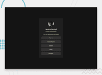
Design comparison
Solution retrospective
Firstly, I completed this challenge. And next i will try complete other challenge.
What challenges did you encounter, and how did you overcome them?The biggest challenge in this project was giving proper margin between card and web page.
Community feedback
- @LuisVera1Posted 8 months ago
Hey thebraudalf
Your solution looks great! To improve the semantics of your HTML, here are some suggestions
--- Use the appropriate HTML element
Use the
<main>to wrap all the content instead a<div>element--- Css
To center the card you could use flexbox
  display: flex;
  justify-content: center;
  align-items: center;
About the resolution, I think it's 1440px x 960px
Check out the following link: Social-links
Hope that's helpful!
Keep the good work!
0 - @thebraudalfPosted 8 months ago
Someone would explain me what is the resolution of the front end solution comparison. Multiple times I get an improper design what's the solution of this?
0
Please log in to post a comment
Log in with GitHubJoin our Discord community
Join thousands of Frontend Mentor community members taking the challenges, sharing resources, helping each other, and chatting about all things front-end!
Join our Discord

