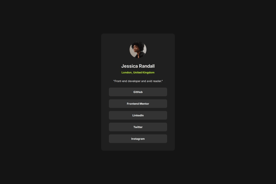
Design comparison
Solution retrospective
I like how overall finished project looks as i tried to keep it as faithful to the design as possible. I'm also happy with CSS structure, i think it's pretty clean and readable.
Next time i would maybe want to use something like TailwindCSS but for now i think that writing styles from scratch is good for expanding on my CSS knowledge.
What challenges did you encounter, and how did you overcome them?In previous challenges majority of my time was spent on figuring out design details like: padding, margins, gaps, line heights etc.
This time i decided to go with Figma file provided with the challenge and it was huge time saver and helped me focus on writing code.
Community feedback
- @AdrianoEscarabotePosted 29 days ago
Hello Michał, how are you? I was really pleased with your project, but I’d like to offer some advice that might help:
To enhance the semantics of your code, consider using a
<ul>
(unordered list) for the collection of links, as it represents a list of related items. Here's an example:<ul> <li><a href="#">GitHub</a></li> <li><a href="#">Frontend Mentor</a></li> <li><a href="#">LinkedIn</a></li> <li><a href="#">Twitter</a></li> <li><a href="#">Instagram</a></li> </ul>
Using a
<ul>
provides clear structure and context, signaling to both browsers and assistive technologies that these links are part of a cohesive group, improving both accessibility and readability.The rest is spot on.
Hope it’s helpful to you. 👍
Marked as helpful0@Michal-MajchrzakPosted 28 days agoHello Adriano 👋,
Thank you for checking my solution and for taking time to write comment. I will soon update my code with your suggestion, i'm still struggling with writing semantic HTML 😄.
Thanks for your help and have a great day.😀
1
Please log in to post a comment
Log in with GitHubJoin our Discord community
Join thousands of Frontend Mentor community members taking the challenges, sharing resources, helping each other, and chatting about all things front-end!
Join our Discord