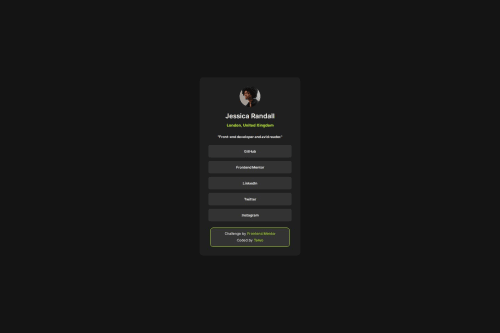
Social links profile using CSS Flex box

Solution retrospective
I'm most proud of how the design and layout turned out to be responsive and visually appealing. The use of fonts, colors, and the overall structure really give the profile a professional look.
What challenges did you encounter, and how did you overcome them?One of the challenges was ensuring that the layout remained consistent across different screen sizes. To overcome this, I used media queries to adjust the styles for smaller screens. Additionally, getting the font sizes and padding just right required some trial and error, but it was rewarding to see it all come together.
What specific areas of your project would you like help with?-
Accessibility: Are there any improvements I can make to enhance the accessibility of the profile?
-
CSS Best Practices: Any suggestions on refining my CSS for better maintainability and readability would be appreciated.
-
Responsive Design: I'd love to hear if there are more efficient ways to make the design responsive across different devices.
Please log in to post a comment
Log in with GitHubCommunity feedback
No feedback yet. Be the first to give feedback on Taiwo Bandipo's solution.
Join our Discord community
Join thousands of Frontend Mentor community members taking the challenges, sharing resources, helping each other, and chatting about all things front-end!
Join our Discord