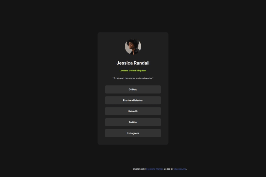
Design comparison
SolutionDesign
Solution retrospective
What are you most proud of, and what would you do differently next time?
I think the design is pretty close to the original one, given I didn't get the Figma files at all to compared. I'm happy that using rem for font-sizes and other things are becoming more natural.
What challenges did you encounter, and how did you overcome them?It was great to get more basic understanding on how some properties of CSS don't cascade at all and practicing the layout.
To size the buttons how I wanted it actually took me a while...
What specific areas of your project would you like help with?Moving forward I must pay more attention to ARIA attributes, since I haven't been using it so far, but it's definitely something everyone is looking for.
Community feedback
Please log in to post a comment
Log in with GitHubJoin our Discord community
Join thousands of Frontend Mentor community members taking the challenges, sharing resources, helping each other, and chatting about all things front-end!
Join our Discord
