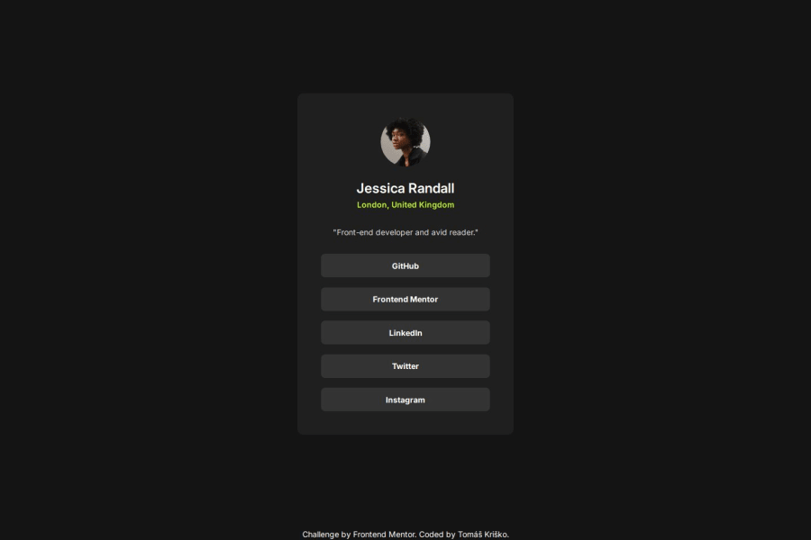
Design comparison
SolutionDesign
Solution retrospective
What are you most proud of, and what would you do differently next time?
That I did a good job in my opinion without having the figma design file. And that I did it in relatively faster time than I expected.
What challenges did you encounter, and how did you overcome them?That I didnt know the lengths, sizes, etc. I eventually just didnt care that much and just did it to enjoy it and not to make it perfect.
What specific areas of your project would you like help with?How to read the sizes just from the design image file. Is it just about practice? Or am I meant to use some tools to measure things from the image?
Community feedback
Please log in to post a comment
Log in with GitHubJoin our Discord community
Join thousands of Frontend Mentor community members taking the challenges, sharing resources, helping each other, and chatting about all things front-end!
Join our Discord
