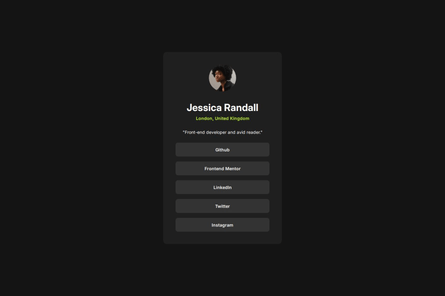
Design comparison
SolutionDesign
Solution retrospective
What are you most proud of, and what would you do differently next time?
Made it using the default CSS Flow Layout
What challenges did you encounter, and how did you overcome them?Making the page responsive was the most challenging thing in this exercise, it turns out the problem arose because I gave a fixed width to my container without including max-width to make it responsive
What specific areas of your project would you like help with?Responsive website
Community feedback
Please log in to post a comment
Log in with GitHubJoin our Discord community
Join thousands of Frontend Mentor community members taking the challenges, sharing resources, helping each other, and chatting about all things front-end!
Join our Discord
