Submitted 7 months ago
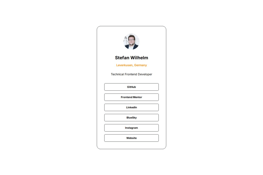
Social links profile solution with flex and lightmode
#node#sass/scss
@stewil87
Design comparison
SolutionDesign
Solution retrospective
What are you most proud of, and what would you do differently next time?
Proud might be overestimated, I tried media prefer light mode for secondary color palette.
What challenges did you encounter, and how did you overcome them?I did it without figma subscription and used paint.net for measurements with the jpgs, so the font sizes etc. are imaginary based.
Community feedback
Please log in to post a comment
Log in with GitHubJoin our Discord community
Join thousands of Frontend Mentor community members taking the challenges, sharing resources, helping each other, and chatting about all things front-end!
Join our Discord

