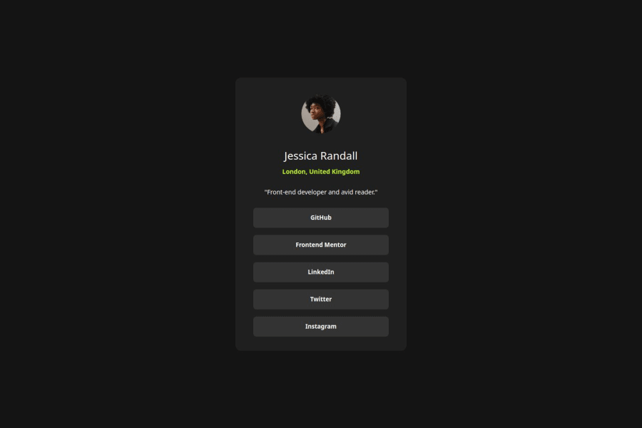
Design comparison
Solution retrospective
I'm happy with it and there isn't a need to change the way I approached it as far as I can tell. Perhaps I'll try the layout using grid if I were to do something similar.
What challenges did you encounter, and how did you overcome them?I had to research how to change the quotation marks. I was able to solve this via stackoverflow.
What specific areas of your project would you like help with?I was quite comfortable with challenge.
Community feedback
- @cahitalpdemirPosted 12 months ago
Looks good. How did you set the pixels ?
0@Devs-advocatePosted 12 months agoHi @cmdemir. I used Microsoft powertoys Screen Ruler to measure the pixel width and height of the card and the elements. It also has a color picker and image resizer. It's free and I already use windows. Its quite good at knowing where the edges are to measure to, when measuring the desktop and mobile previews. Here's a link to show what stuff powertoys has. https://www.youtube.com/watch?v=aynPEUO3fl0
0@cahitalpdemirPosted 12 months agoHi @Devs-advocate, thanks for sharing these good advices
0
Please log in to post a comment
Log in with GitHubJoin our Discord community
Join thousands of Frontend Mentor community members taking the challenges, sharing resources, helping each other, and chatting about all things front-end!
Join our Discord
