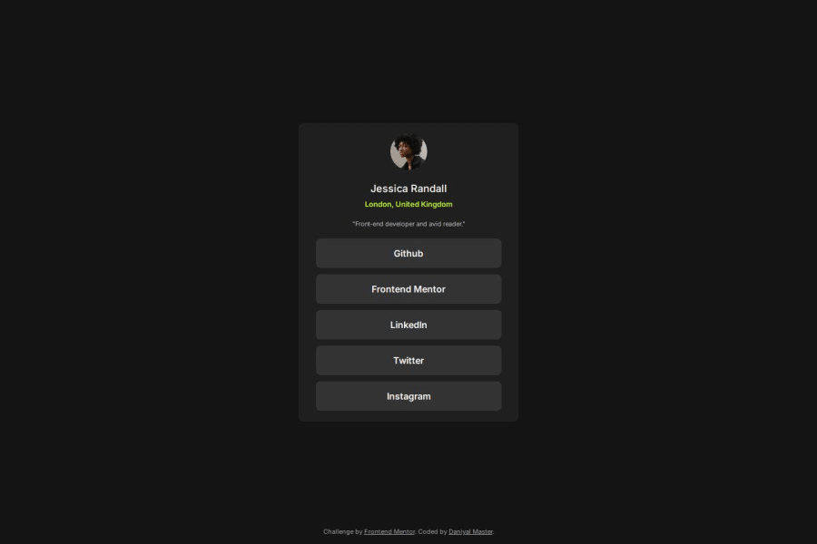
Design comparison
Solution retrospective
I started by creating all the HTML elements and assigning them classes. I moved onto the CSS, and started by adding the background color to body. Next, I started to design the card, and spent some time experimenting with small details until I go the look I liked. I then moved to styling elements like text, images, and finally the social divs. Furthermore, I spent a lot of time trying to solve issues with the design of the social elements, spacing, and other visual bugs. After writing things out, and taking some time think, I came back and solved my issues. Overall, this project helped me improve my problem solving skills, and allowed me to further improve my vanilla CSS skills. Once I finished, I tested the website on multiple broswers, and used the built in device size emulation feature to view what the website would look like on different devices. My next steps, would be to try to get the exact sizes and scaling a bit better.
Community feedback
Please log in to post a comment
Log in with GitHubJoin our Discord community
Join thousands of Frontend Mentor community members taking the challenges, sharing resources, helping each other, and chatting about all things front-end!
Join our Discord
