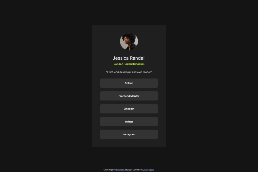
Design comparison
Solution retrospective
I would like to think I kept the HTML pretty basic, which made the CSS more maintainable. However, this was a pretty basic page and was easier to keep simple anyway.
What challenges did you encounter, and how did you overcome them?I had some trouble with the list, as I used an unordered list for my list of links. The problem was that there was always some padding to the left of the links, probably from the bullet that comes with them. Despite having the list-style as none, the padding was still there. I was able to fix it by changing them to display: flex, but that feels more like a workaround than a real solution.
This was also my first project where I didn't have access to the Figma files, so I had to eyeball a lot of the padding, margins, and corner roundness values.
Community feedback
Please log in to post a comment
Log in with GitHubJoin our Discord community
Join thousands of Frontend Mentor community members taking the challenges, sharing resources, helping each other, and chatting about all things front-end!
Join our Discord
