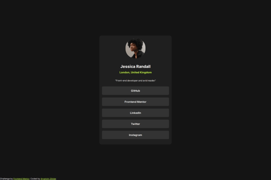
Design comparison
SolutionDesign
Solution retrospective
What are you most proud of, and what would you do differently next time?
Accumulated practice of the basic layouts, got more confident with the box model.
What challenges did you encounter, and how did you overcome them?I could not add vertical margins to anchor tags. A few google searches away I realized that the anchor tags are inline (they ignore vertical margins), so I changed them to block elements.
What specific areas of your project would you like help with?I'd like feedback on:
- The Design
- Naming conventions
- Code Conciseness
- Future development (I plan on adding a night mode/dark mode feature made with vanilla CS and JS)
Community feedback
Please log in to post a comment
Log in with GitHubJoin our Discord community
Join thousands of Frontend Mentor community members taking the challenges, sharing resources, helping each other, and chatting about all things front-end!
Join our Discord
