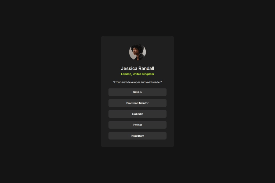


Design comparison

Solution retrospective
I am most proud of successfully implementing a structured and responsive design using CSS Flexbox while maintaining clean and readable code. Next time, I would refine the hover effects further to create smoother transitions that align more closely with the design prototype.
What challenges did you encounter, and how did you overcome them?One challenge I faced was that the .card size was not adjusting properly. After debugging, I found that the issue was caused by the .links container having width: 100%, which made the buttons expand fully while the .card itself did not explicitly have width: 100%. This caused inconsistent sizing. The solution was to add width: 100% to .card to ensure proper expansion and a stable layout.
What specific areas of your project would you like help with?I would like help in refining my CSS hover effects to match the prototype more accurately. While I have implemented transitions, the hover effect doesn’t feel exactly the same as in the prototype. Any guidance on improving the timing, easing functions, or other CSS properties to achieve a more precise match would be greatly appreciated.
Community feedback
Please log in to post a comment
Log in with GitHubJoin our Discord community
Join thousands of Frontend Mentor community members taking the challenges, sharing resources, helping each other, and chatting about all things front-end!
Join our Discord