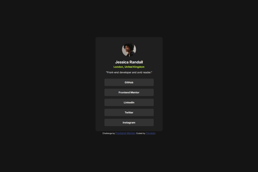
Not Found
Not Found
Not Found
Not Found
Not Found
Not Found
Not Found
Not Found
Not Found
Not Found
Not Found
Not Found
Not Found
Not Found
Not Found
Not Found
Not Found
Not Found
Not Found
Not Found

Submitted

Social Links Profile Solution

@yaywonah

Desktop design screenshot for the Social links profile coding challenge

This is a solution for...

  • HTML
  • CSS
1newbie
View challenge

Design comparison


SolutionDesign

Solution retrospective


What are you most proud of, and what would you do differently next time?

I coded up this project without having to look up tutorials or refresh my memory. I also knew how to add the hover state in the CSS this time thanks to the last Blog Preview project.

What challenges did you encounter, and how did you overcome them?

I still had trouble adjusting sizes on desktop from mobile. I think it's partly because everything looks bigger on my laptop screen. I didn't pay for Pro, so I had to eyeball all the spacing and sizes.

What specific areas of your project would you like help with?

I saw that the pointer cursor in the active states screenshot was black as opposed to white. Is there a way to style the cursor: pointer in CSS to be black? Or does it have to be a custom pointer: url()?

Community feedback

@KapteynUniverse

Posted

When i did this challenge, that cursor confused me too. As far as i searched back then there is no black pointer. Like you guessed, you need to use url()

https://www.w3schools.com/cssref/tryit.php?filename=trycss_cursor

Marked as helpful

0
Laura 30

@Temiloluwa16

Posted

your CSS code is quite neat. You did a good job with the mobile responsiveness. How were you able to achieve that?

1

@yaywonah

Posted

@Temiloluwa16

So for mobile responsiveness, I coded the project while focusing on the mobile design first! So everything before @media (min-width: 1200px) is basically my CSS for the mobile design.

I could have added a media query for mobile (for example: @media (min-width: 375px), but I didn't want to re-type the same CSS three times. ex: I would have had to write this code block three times! One for the base, media mobile query, media desktop query.

h2 {  /*for the "London, United Kingdom" in my html */
    color: hsl(75, 94%, 57%);
    margin-bottom: 20px;
}

Instead, I used the mobile design as my base and added a media query just for desktop, eliminating the need to rewrite some of my CSS for a third time. Sorry if this is unclear in any way, if you have more questions then I'd be happy to try and explain further!

1
Laura 30

@Temiloluwa16

Posted

This approach makes sense actually. Thank you for your response. I'll reach out to you if I have further questions. @yaywonah

0

Please log in to post a comment

Log in with GitHub
Discord logo

Join our Discord community

Join thousands of Frontend Mentor community members taking the challenges, sharing resources, helping each other, and chatting about all things front-end!

Join our Discord