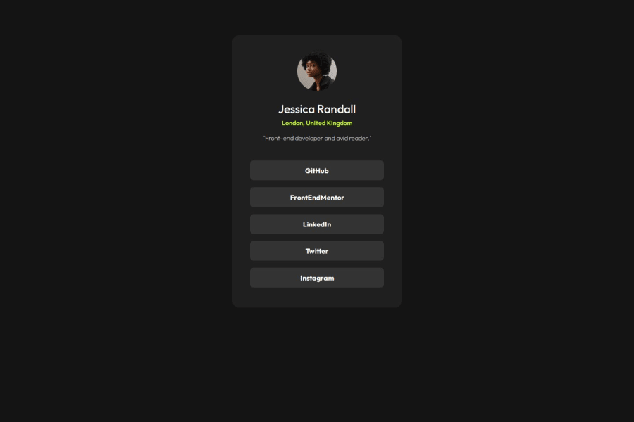
Not Found
Not Found
Not Found
Not Found
Not Found
Not Found
Not Found
Not Found
Not Found
Not Found
Not Found
Not Found
Not Found
Not Found
Not Found
Not Found
Not Found
Not Found
Not Found
Not Found

Submitted

Social links profile solution

RajanCP 50

@RajanCP

Desktop design screenshot for the Social links profile coding challenge

This is a solution for...

  • HTML
  • CSS
1newbie
View challenge

Design comparison


SolutionDesign

Solution retrospective


What are you most proud of, and what would you do differently next time?

  • Proud of my ability to understand how to structure html so it is semantically correct.
  • Additionally, understand how to use media queries to make my website responsive.

What challenges did you encounter, and how did you overcome them?

  • Had not come across for lists and therefore had to research it

Community feedback

@SvitlanaSuslenkova

Posted

You have <main> and <div class="container">. You don't need two, just one is fine. Also when you want to align project to the center with flex or grid add min-height: 100vh; As now your aligns everything to the center of it's height, not to the center of your view. Hope you found this comment helpful :)

0

RajanCP 50

@RajanCP

Posted

@SvitlanaSuslenkova Hi Svitlana, I only added <main> since someone earlier said it is semantically correct to include it but I agree with you.

Also, wouldn't using "min-height:100vh" stretch the container to the full height of the viewport which looks odd. Am I adding this in the wrong place?

0

@SvitlanaSuslenkova

Posted

@RajanCP you have max-height not to stretch anything too much

0
RajanCP 50

@RajanCP

Posted

@SvitlanaSuslenkova Sorry I think I don't understand.

0

@SvitlanaSuslenkova

Posted

@RajanCP you have to add flex to the parent component. It's the component inside which you want to center your project. Try:

body { display: flex; flex-direction: column; justify-content: center; align-items: center; min-height: 100vh; }

Marked as helpful

0
RajanCP 50

@RajanCP

Posted

@SvitlanaSuslenkova Yes, that appears to have kept it centred regardless of whether I zoom in and out. Sorry to ask again, but why does the min-height: 100vh keep it centred? How would you say what the code does in plain English.

0

@SvitlanaSuslenkova

Posted

@RajanCP your project was centered before min-height: 100vh; The problem is that it centers to it's height and it's height is not full height of the screen, but the height of your content.

1
RajanCP 50

@RajanCP

Posted

@SvitlanaSuslenkova I see, thank you

0
MikDra1 6,090

@MikDra1

Posted

I encourage you to use this technique to make the card responsive with ease:

.card {
width: 90%;
max-width: 600px;
}

On the smaller screens card will be 90% of the parent (here body), but as soon as the card will be 600px it will lock with this size.

Also to put the card in the center I advise you to use this code snippet:

.container {
display: grid;
place-items: center;
}

Hope you found this comment helpful 💗💗💗

Good job and keep going 😁😊😉

0

RajanCP 50

@RajanCP

Posted

@MikDra1 Thank you for the response! Will keep this in mind

0

@babalonogqala23

Posted

great work it is kind of hard to make something pixel-perfect but you did very well.

0

RajanCP 50

@RajanCP

Posted

@babalonogqala23 Thank you, use I don't have access to figma files

1

Please log in to post a comment

Log in with GitHub
Discord logo

Join our Discord community

Join thousands of Frontend Mentor community members taking the challenges, sharing resources, helping each other, and chatting about all things front-end!

Join our Discord