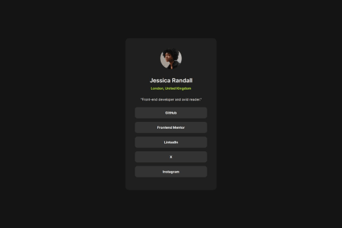
Social links profile solution

Solution retrospective
I didn't have access to the design file, so I am pleased with how close I got eye-balling the design images.
I experimented with the clamp() calc() functions for the first time - I am not sure if it was necessary to use them, but it seems to have made the design more responsive without needing a media query.
As always, I find it challenging to match the widths and spacing to the design. The desktop design image seems to be wider than the mobile, and I am not sure how the designer would expect that to be achieved by the dev without declaring a width.
At first, I did not include a width property at all for my .social-card, but then it did not match the desktop designs width relying solely on its content and some padding. I hope by using max-width and rem units, it is a little better than fixed pixels?
- I would love to know any other way of achieving the wider desktop width shown in the design image without declaring a width.
- I would like to know if my semantic html was overkill or not enough!
- My custom properties are based on eye-balling the design, so may be incorrect. Let me know if there were simpler spacing solutions! I applied them to margins; if there was a better approach, please let me know.
- Any accessibility tips, as I have not yet learnt much about it.
Thanks!
Please log in to post a comment
Log in with GitHubCommunity feedback
No feedback yet. Be the first to give feedback on Jo_WithVision's solution.
Join our Discord community
Join thousands of Frontend Mentor community members taking the challenges, sharing resources, helping each other, and chatting about all things front-end!
Join our Discord