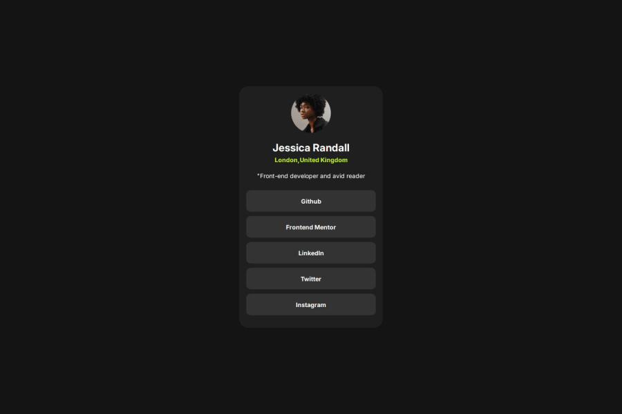


Design comparison
SolutionDesign

Please log in to post a comment
Log in with GitHubCommunity feedback
- P@Oleksandr5768965
1)there are no spaces before tags in html, the code is difficult to read
2)the main container has a fixed width that does not match the design
3)on narrow screens the card does not shrink and goes beyond the limits
4)html code has no tabs and also has no semantic tags
5)the solution does not have a smooth color change when hovering, also the width and height do not match the design

Join our Discord community
Join thousands of Frontend Mentor community members taking the challenges, sharing resources, helping each other, and chatting about all things front-end!
Join our Discord