

Design comparison

Solution retrospective
I am facing difficulty in creating exact size of the overall layout as well as the containing elements as per the designs.
In the last two challenges I got everything smaller than the design. And in this challenge I think I have made it larger than the design.
I have tried using fixed units as well for the layouts but that also does not seem to work
What specific areas of your project would you like help with?Kindly guide me on how to get the exact size of the overall layout and elements converted to code.
Sometimes I make the layout larger than the design and sometimes smaller.
Community feedback
- @DylandeBruijnPosted 10 months ago
Hi @noormuhammadraza,
Congratulations on a great looking solution! I can tell you put a lot of effort in it. I like your use of clear descriptive classes, good job!
A bit of friendly constructive feedback:
-
For the title you currently use a
ptag, you could change this into ah1so give it more semantic meaning. Because in this example it's the most important heading on the page. -
It's not always needed to wrap elements in a
div. You could remove thedivaround.profile-biofor example and achieve the same styling. Aptag is ablockelement by default! If you need to layout something specifically by using Flexbox or Grid you could wrap the elements in adiv. -
I see you used borders to maybe make it easier for you to understand the layout, I like that! A little trick I learned is to use this:
* {
  outline: 1px solid red;
}
This puts a red outline on every element on the page, which helps you debug CSS problems. A benefit of outline is that it doesn't take up any space like a border does.
- To answer your question about the exact size of the overal layout. You could use this piece of CSS:
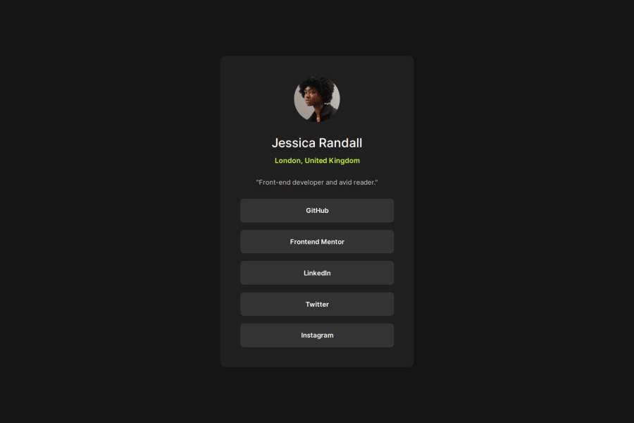
.profile-card {
    max-width: 325px;
    background-color: var(--dark-grey);
    padding: 1.65em;
    border-radius: 12px;
    width: 100%;
}
So you set a
max-widthon the card so it doesn't grow above a certain fixed width. But thewidth: 100%still allows it to scale on smaller viewports. It's a guessing game to get the exact size of the card if you don't have the design file. And to be honest I won't worry about it too much. But it's good that you try to get your solution looking exactly like the design. It's a good mindset.I hope you find my feedback helpful and let me know if you have more questions, always happy to help.
Marked as helpful0@noormuhammadrazaPosted 10 months agoHey @DylandeBruijn,
Thank you so much for such an amazing and helpful feedback. It means alot to me. All the compliments that I received here made me feel proud of myself and gave me a reason to be better and do more. Developer community needs more people like you.
Your feedback was full of helpful suggesstions and tips which I will certainly use in my future projects. I appreciate you taking some time out and checking my solution. Once again thank you for your suggesstions.
1 -
- @devchsykasPosted 10 months ago
Hi, here are some of my suggestions for further improvement:
1)Use more semantic elements to improve the readability and accessibility of your HTML 2)Ensure that social media links are actual hyperlinks, providing proper navigation and improving user experience.
Marked as helpful0


Please log in to post a comment
Log in with GitHubJoin our Discord community
Join thousands of Frontend Mentor community members taking the challenges, sharing resources, helping each other, and chatting about all things front-end!
Join our Discord