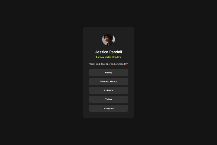
Social links profile semantic HTML only
Design comparison
Solution retrospective
I'm really happy with my final result, only slightly bummed that I ended up putting the profile's bio outside of the Header section because I felt like I was already wrapping too much stuff in general and I would have needed to do so once more to adjust the padding.
I also saw that as long as one works on these simple designs semantic HTML is 99% of what is needed to make it accessible so I'll consider Aria-labels etc. later one with more difficoult challenges, which means tailwind will be next!
What challenges did you encounter, and how did you overcome them?I really tried strictly following the Figma design, lost a lot of time trying to navigate the App and I want to be more comfortable with it in the future. I eye balled the CSS animation since I don't think Figma's free plan displays info about it anywhere(and if so I couldnt find it)
Community feedback
Please log in to post a comment
Log in with GitHubJoin our Discord community
Join thousands of Frontend Mentor community members taking the challenges, sharing resources, helping each other, and chatting about all things front-end!
Join our Discord
