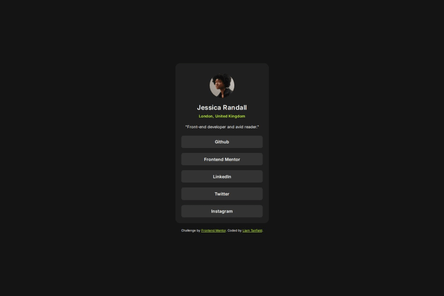
Design comparison
Solution retrospective
At this point, I have felt confident in making simple HTML/CSS projects after learning for over a year, of course I always appreciate constructive criticism and how to improve for the next project!
What challenges did you encounter, and how did you overcome them?I didn't encounter any obstacles during making this project.
What specific areas of your project would you like help with?Overall criticism in anything from my code to the structure, I like to know how to do something better no matter what it is!
Community feedback
- @Alex-Archer-IPosted 8 months ago
Hey!
That a first time when I see such usage of
h1tag! It's cool finding, but I think a bit redundant =)And a few tips =)
- You can reduce the number of tags you use. For example, you have
sectiontag so there is no need in container div, or, theimgtag could be styled directly without wrapper. - This is a links, so
atag more suits here thanbuttons. Also this is a list, so you can useulandli.
<ul>
    <li><a href="#">Link here!</a></li>
    <li><a href="#">Link here!</a></li>
    <li><a href="#">Link here!</a></li>
</ul>
Overall, you did great work, and it's very cool that you are trying to paid attention to accessibility and optimization =)
Marked as helpful1@TanDevvPosted 8 months ago@Alex-Archer-I Hi, Alex!
You're completely right about the buttons, I will be honest I actually know you should add
atags for links, I don't know why I added buttons I think I was in autopilot during developing this and I didn't even notice! I definitely would have done the links like you suggested via aultag.The
h1tag was actually suggested to me by another long-time user of this website when you don't find a h1 appropriate anywhere so you can add it for screen-users, I'd say it may not be necessary for this project but I tend to like to add it when I can't find a place for a h1.I agree with the number of tags, I definitely could have been a bit cleaner with how many I added, I think it is a bad habit of mine that I like to add
imgtags in a container as I feel like it makes them easier to style but I think you're right that it isn't necessary.Thank you for the suggestions, I appreciate it :)
1@Alex-Archer-IPosted 8 months ago@TanDevv
Well, they looks very like buttons, so it's easy to confuse them during the hard work mode 😅
I get you point about
h1, but I think that since it's purpose more like title than description, almost anything could be theh1. For example if you look to your profile page here, on the Frontend Mentor, you'll see that your name ish1. So I guess "Jessica Randall" fit here as well.And you're welcome! Feel free to ask, comment and stuff if need =)
1 - You can reduce the number of tags you use. For example, you have
Please log in to post a comment
Log in with GitHubJoin our Discord community
Join thousands of Frontend Mentor community members taking the challenges, sharing resources, helping each other, and chatting about all things front-end!
Join our Discord
