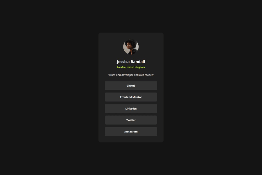
Design comparison
Solution retrospective
I'm getting used to using Flexbox and somehow understand how it should be used. I incorporated sass variables to the stylesheet for the repeated color.
What challenges did you encounter, and how did you overcome them?Following the correct sizes of the elements (card padding, margin, image size) is not easy when you don't have figma. Keen eye to details is very much needed here.
What specific areas of your project would you like help with?I would appreciate any feedback on the proper structure of html. I am still not confident if I am using the right tags for each element.
Community feedback
- @carstenkoernerPosted 12 months ago
Your solution looks very good. Recognizing and rebuilding the correct dimensions without Figma is not easy, especially at the beginning. But it will get better with time.
Regarding the HTML structure, the only thing I noticed is that you could choose a heading for the name (e.g. h3). Otherwise, it is important for accessibility that you also define a focus in addition to the hover. This helps disabled people when they scroll through the elements on a page using the Tab key on the keyboard.
JM2C
Marked as helpful1@sharms-myPosted 12 months ago@carstenkoerner Thanks! I forgot about adding the focus element, I'm going to add them.
0 - @NatthanichaThaPosted 12 months ago
Good job, Sharm. And, also thank you for your comment on my solution yesterday. Have a nice day! :D
0
Please log in to post a comment
Log in with GitHubJoin our Discord community
Join thousands of Frontend Mentor community members taking the challenges, sharing resources, helping each other, and chatting about all things front-end!
Join our Discord
