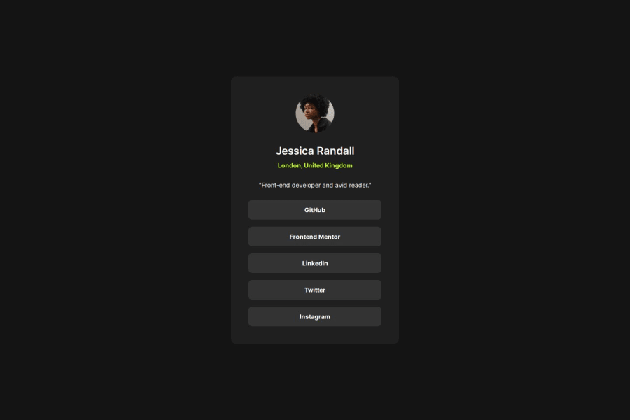
Design comparison
SolutionDesign
Solution retrospective
What are you most proud of, and what would you do differently next time?
I’m proud that I completed this project in under an hour and that I’m becoming increasingly comfortable with Flexbox. Additionally, I made a conscious effort to avoid using px units, as suggested by my peers, and instead opted for more responsive units. I’m also really pleased with how the transition effect on the buttons turned out.
What challenges did you encounter, and how did you overcome them?I didn’t encounter any challenges during this project. Everything went smoothly.
What specific areas of your project would you like help with?I would appreciate feedback on my CSS code and any tips for improving it.
Community feedback
Please log in to post a comment
Log in with GitHubJoin our Discord community
Join thousands of Frontend Mentor community members taking the challenges, sharing resources, helping each other, and chatting about all things front-end!
Join our Discord
