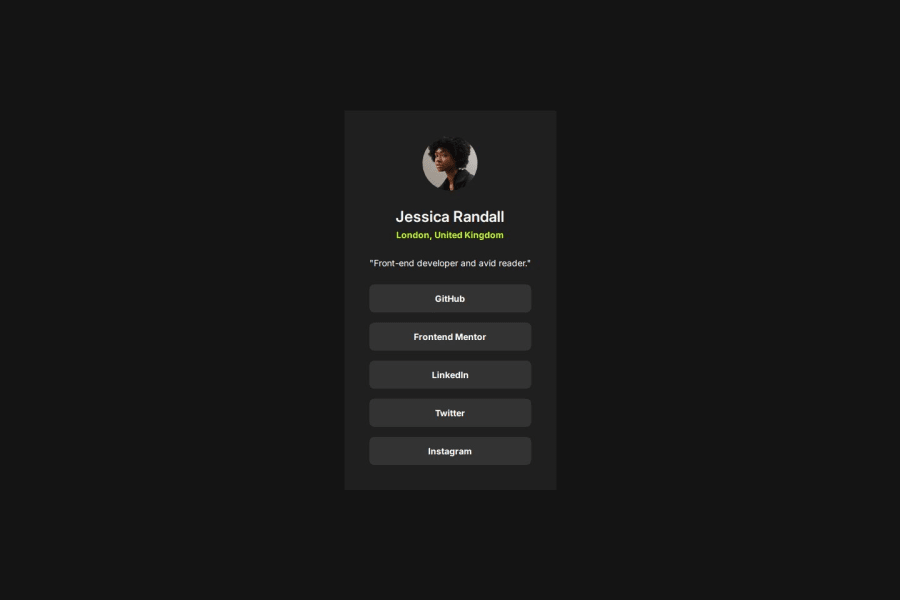
Design comparison
SolutionDesign
Solution retrospective
What are you most proud of, and what would you do differently next time?
I am most proud that I coded it mobile first. Next time I will take more time to understand flex using vanilla HTML/CSS.
What challenges did you encounter, and how did you overcome them?My elements didn't quite line up on the evaluation. I went back to the Figma file to see what values I might have wrong.
What specific areas of your project would you like help with?I want a better understanding of Flexbox when working with vanilla HTML/CSS.
Community feedback
Please log in to post a comment
Log in with GitHubJoin our Discord community
Join thousands of Frontend Mentor community members taking the challenges, sharing resources, helping each other, and chatting about all things front-end!
Join our Discord
