Submitted 11 months ago
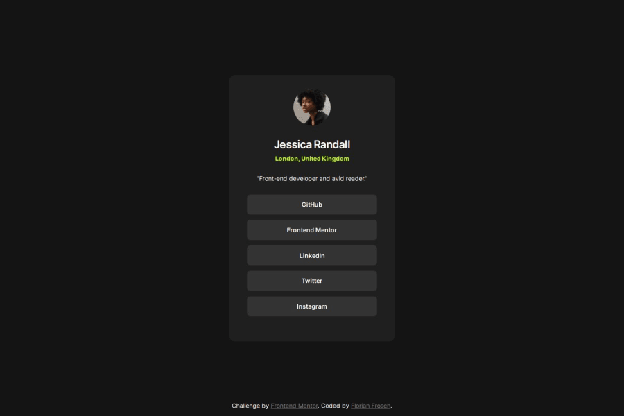
Social links profile | react, emotion, css custom properties
#emotion#react#vite#typescript

@ffrosch

Design comparison
SolutionDesign

Solution retrospective
What are you most proud of, and what would you do differently next time?
I really like trying out different approaches for CSS-in-JS. I think my style objects worked well, but it becomes clear that a component based approach will be necessary for larger projects to keep things simple.
What challenges did you encounter, and how did you overcome them?I used absolute positioning to center the element and I enjoyed learning a bit more about this method. But I also found it quite hard to get everything right and had to make countless small adjustments to fix inconsistencies in the design.
What specific areas of your project would you like help with?Nothing specific right now.
Community feedback
Please log in to post a comment
Log in with GitHub
Join our Discord community
Join thousands of Frontend Mentor community members taking the challenges, sharing resources, helping each other, and chatting about all things front-end!
Join our Discord