Design comparison
SolutionDesign
Solution retrospective
What are you most proud of, and what would you do differently next time?
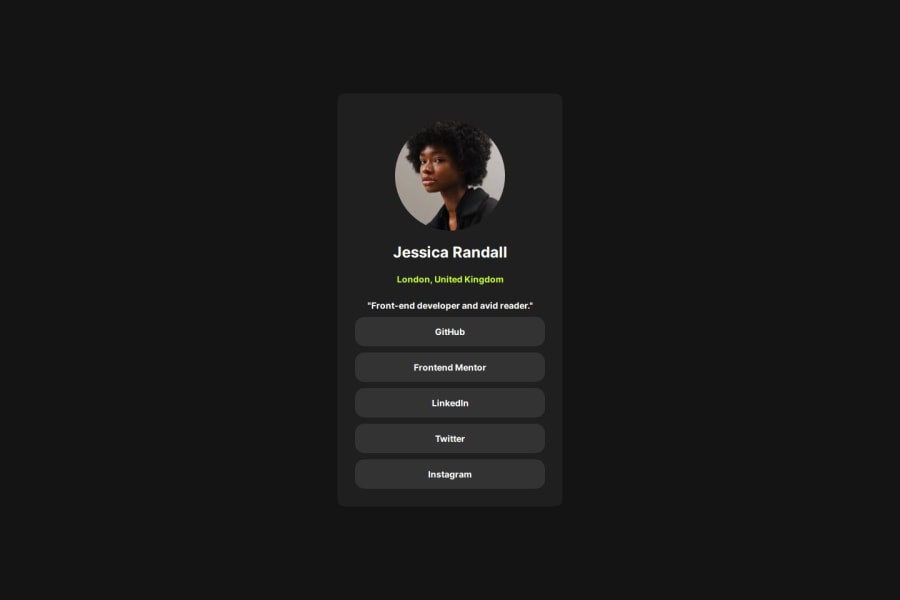
Using Grid to center the element on the page. I also used Flexbox on smaller elements.
What challenges did you encounter, and how did you overcome them?Trying to center the text on a element. I looked up text-align. I had to play around with the sizing of the Padding and Margin's to get things lined up.
What specific areas of your project would you like help with?Any tips or suggestions are welcome!
Community feedback
Please log in to post a comment
Log in with GitHubJoin our Discord community
Join thousands of Frontend Mentor community members taking the challenges, sharing resources, helping each other, and chatting about all things front-end!
Join our Discord
