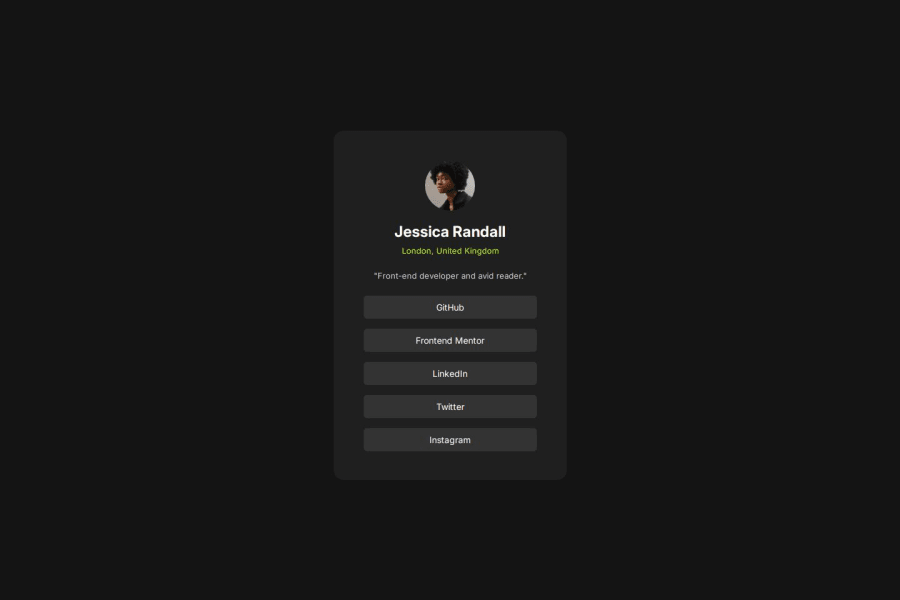
Design comparison
Solution retrospective
After finishing the mini project, what I was proud of was the number of lines I used, as I usually have more than 200 for this type of projects. This time, I managed to work more efficiently.
What challenges did you encounter, and how did you overcome them?One of the challenges I faced was organizing the CSS to account for the variables and the specified format.
What specific areas of your project would you like help with?I would like to get feedback on how I could improve the efficiency of my code overall.
Community feedback
- @giovanni-bandinelliPosted about 12 hours ago
To be honest I have nothing to say,if you changed the font weight in .card__location and .card__links to be var(--fwsemibold) and tried to adjust the padding inside the links you'd have a pixel perfect replica.
the code is also well organized, especially the CSS, I should take notes ahah
0
Please log in to post a comment
Log in with GitHubJoin our Discord community
Join thousands of Frontend Mentor community members taking the challenges, sharing resources, helping each other, and chatting about all things front-end!
Join our Discord
