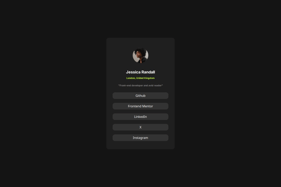
Design comparison
SolutionDesign
Solution retrospective
What are you most proud of, and what would you do differently next time?
I think I am getting better at using tailwind CSS. I am really proud of myself that i still managed to continue doing this project.
What challenges did you encounter, and how did you overcome them?My challenges i faced was my page is not so responsive when i tested on mobile and tab. After i modify some of my code, I think its work already.
What specific areas of your project would you like help with?Nothing so far.
Please log in to post a comment
Log in with GitHubCommunity feedback
- @rafbar2000rr
When you click any button, you should be directed to an URL. To do this, you can wrap each button by an anchor (<a>) tag, this way:
<a href="https://github.com"> <button class="w-full text-white bg-[#333333] my-[10px] p-[5px] rounded-xl hover:bg-slate-600 active:bg-slate-700 focus:outline-none focus:ring focus:ring-slate-300" > Github </button> </a>
Join our Discord community
Join thousands of Frontend Mentor community members taking the challenges, sharing resources, helping each other, and chatting about all things front-end!
Join our Discord
