

Design comparison

Solution retrospective
I'm proud of coding faster than the last projects that I did.
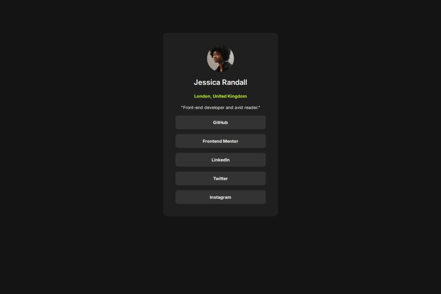
What specific areas of your project would you like help with?I would like to have some help to stick perfectly to the design in the sizing card, because I have a shift.
Community feedback
- @MarziaJaliliPosted 7 days ago
Hats off to you!
A tiny area you can amend:
- For a smoother color change of the links, you can consider using the
transitionproperty:
transition: color 0.5s, background-color 0.5s;

/* or if you need it not just for color but for the entire element... */
transition: 0.5s;
This enusres that the changes will be brought after 500 milliseconds which makes it look even better.
Great job overall, keep up the grind!
😎😎😎
Marked as helpful0P@CodeNautiquePosted 7 days ago@MarziaJalili Thank you for your feedback, I see where I need to focus on. The next step is to learn advanced CSS techniques like animation ;)
1 - For a smoother color change of the links, you can consider using the
- P@mci3xPosted 6 days ago
Really nice!
Maybe try not to style your
<main>at allwidth: 23.4375rem; height: 50.75rem;I think it might help you with positioning.
0 - @x-147Posted 7 days ago
to fix the shift, inside body tag add:
align-items: center;
min-height: 100vh;
align-items will take the card to the centre of the screen (along the vertical axis), and min-height provides the space needed for the card to move.
0P@CodeNautiquePosted 6 days ago@x-147 hi, I did this but the result is not what the design is
0@x-147Posted 6 days ago@CodeNautique i can see your new commits from 3hrs ago, i ran the code locally and it looks good now (i.e centering is correct).
you will have to click on "generate new screenshot" to see updated design comparison on this page.
0


Please log in to post a comment
Log in with GitHubJoin our Discord community
Join thousands of Frontend Mentor community members taking the challenges, sharing resources, helping each other, and chatting about all things front-end!
Join our Discord