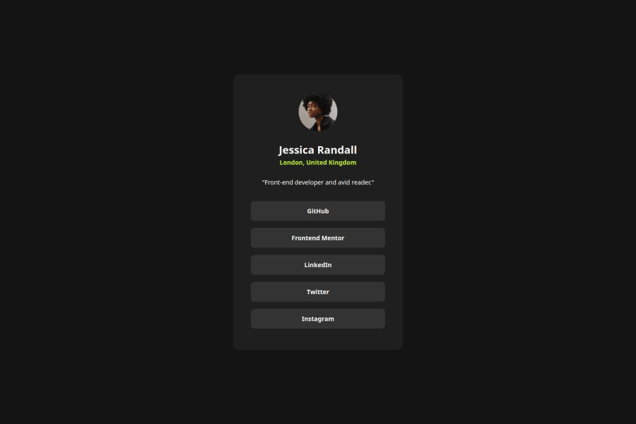
Design comparison
SolutionDesign
Solution retrospective
What are you most proud of, and what would you do differently next time?
I am happy with the buttons that have focus state and custom cursor
button:focus {
    outline: none;
    box-shadow: 0 0 0 1px var(--green);
    cursor: url('./assets/handcursor.svg'), auto;
}
The most difficult part was changing a cursor color. I had to find and include custom cursor in the project.
What specific areas of your project would you like help with?I have multiple @font-face at-rules in my style.css
Shall I put them into another file? Is there a way to compress them?
Join our Discord community
Join thousands of Frontend Mentor community members taking the challenges, sharing resources, helping each other, and chatting about all things front-end!
Join our Discord
