

Design comparison

Solution retrospective
First time implement a design without the figma file.
What challenges did you encounter, and how did you overcome them?Hard to measure the distance between elements and the font size and weight with out the figma file
What specific areas of your project would you like help with?How can we measure the distance, font size, font weight when we just have a picture?
Community feedback
- @AdrianoEscarabotePosted 4 months ago
Hello oddcc, how are you? I was really pleased with your project, but I’d like to offer some advice that might help:
To improve the semantics and accessibility of your code, consider using the
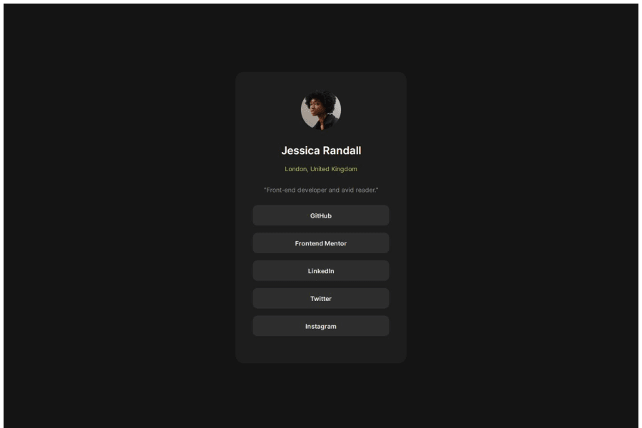
<ul>(unordered list) element to group related links. The<ul>tag is ideal for representing collections, such as a list of social media links or navigation items.Using
<ul>not only makes your code more structured and meaningful, but it also helps assistive technologies identify the group as a related set of items, enhancing the experience for screen reader users. Additionally, this approach improves overall readability and maintainability of your HTML.Example:
<ul>
  <li><a href="#">GitHub</a></li>
  <li><a href="#">Frontend Mentor</a></li>
  <li><a href="#">LinkedIn</a></li>
  <li><a href="#">Twitter</a></li>
  <li><a href="#">Instagram</a></li>
</ul>
In this example:
- The <ul> wraps the entire group, indicating that these links are related.
- Each item is enclosed in a <li> (list item), which provides a clear structure and logical grouping.
This method is particularly useful for navigation menus, social media links, or any set of grouped items, offering better support for both SEO and screen readers.
Pro Tip: Avoid using
<div>elements alone for lists, as they don’t convey the same semantic meaning. Whenever possible, choose semantic tags like<ul>or<ol>to improve the quality of your code.The rest is spot on.
Hope it’s helpful to you. 👍
Marked as helpful1 - @raozhaizhuPosted 4 months ago
This is good, but the address bar hasn't been changed to green, so it's not very noticeable. It would be better if the color stood out more for easier visibility.
1@oddccPosted 4 months ago@raozhaizhu Thank you for the comment. I picked the color with "Digital color meter" on macOS. I guess I should have picked the pixels with lighter green. I also notice that the location and the bio sections are darker than the design. Could you advise me how to accurately decide which colors to use if I only have the design image but not the Figma file? Thanks!
0@raozhaizhuPosted 4 months ago@oddcc I use the screenshot tool Snipaste, which allows you to pick RGB colors by pressing the 'C' key while capturing a screenshot. You candirectly extract colors from the preview image using Snipaste! (Of course, other screenshot tools offer similar features, so choose one based on your needs.)
1


Please log in to post a comment
Log in with GitHubJoin our Discord community
Join thousands of Frontend Mentor community members taking the challenges, sharing resources, helping each other, and chatting about all things front-end!
Join our Discord