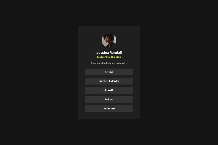
Design comparison
SolutionDesign
Solution retrospective
What are you most proud of, and what would you do differently next time?
Took advice from previous project on board. Also made the card scalable upon screen resizing. Centred it properly and didn't use the font size hack.
What challenges did you encounter, and how did you overcome them?Had issues with media queries as it's been a while since I learned it. Also had issues with centering the divs inside the card.
What specific areas of your project would you like help with?Code review and making sure I got the and parts right.
Community feedback
Please log in to post a comment
Log in with GitHubJoin our Discord community
Join thousands of Frontend Mentor community members taking the challenges, sharing resources, helping each other, and chatting about all things front-end!
Join our Discord
