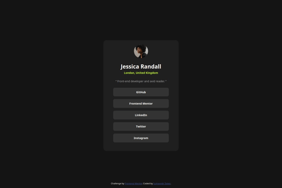
Design comparison
Solution retrospective
I am proud of my speed and accuracy. it took me about 3hrs to complete this project with little to no challenge whatsoever
What challenges did you encounter, and how did you overcome them?None
What specific areas of your project would you like help with?I am not a pro user, so I did not have access to the design file. So I would appreciate any feedback that would help me achieve precision
Community feedback
- @Papi84Posted 7 months ago
Semantic HTML: my use of semantic HTML is strong overall. I noticed appropriate use of
<header>,<nav>, and<footer>tags, which help define the structure clearly. However, there are some areas, like in the main content, where using<section>or<article>instead of<div>would improve both the clarity and accessibility of the content.Accessibility: The solution is quite accessible, but there are a few areas for improvement. For example, adding
aria-labelsto interactive elements like the buttons and ensuring that all images have descriptivealtattributes would enhance accessibility. Also, consider reviewing the color contrast to ensure it meets accessibility standards, particularly for users with visual impairments.Responsiveness: The layout on this project, generally works well across various screen sizes. I noticed that on smaller screens, some elements in the navigation and footer could benefit from better alignment or resizing to maintain a clean, user-friendly interface. Fine-tuning your media queries could help resolve these issues and improve overall responsiveness.
Code Structure & Readability: codes are well-organized and relatively easy to follow. To further enhance readability, consider modularizing your CSS by breaking it into smaller files, possibly using a preprocessor like SASS. This approach can make the code more maintainable in the long run. Also, adopting a more consistent naming convention across your CSS classes would improve clarity.
Design Fidelity: The solution on my site is quite close to the original design. There are minor differences, particularly in the spacing and font sizes, that could be adjusted to better match the design specifications. Paying attention to these finer details can significantly improve the overall look and feel of your project.
1
Please log in to post a comment
Log in with GitHubJoin our Discord community
Join thousands of Frontend Mentor community members taking the challenges, sharing resources, helping each other, and chatting about all things front-end!
Join our Discord
