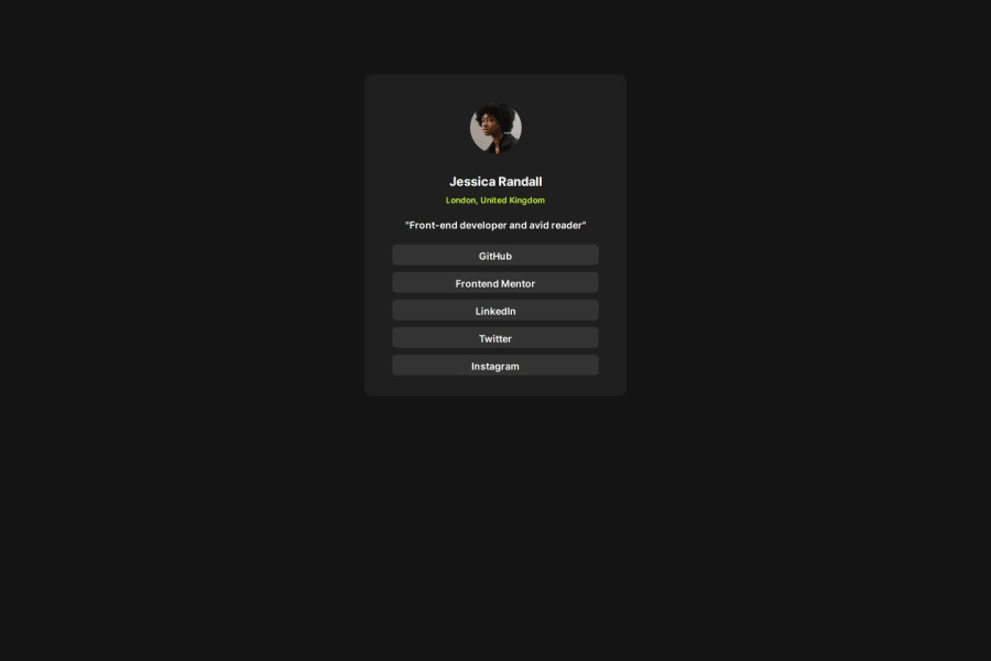
Design comparison
SolutionDesign
Solution retrospective
What are you most proud of, and what would you do differently next time?
I love the fact that i used display flex and justify content to center my items but next time i will try to use other layout technique.
What challenges did you encounter, and how did you overcome them?I found it hard to figure out the correct font sizes and weight without the figma files but i tried my best by using the images from the design folders
What specific areas of your project would you like help with?I would like to transition the profiles background colors smoothly to green
Community feedback
Please log in to post a comment
Log in with GitHubJoin our Discord community
Join thousands of Frontend Mentor community members taking the challenges, sharing resources, helping each other, and chatting about all things front-end!
Join our Discord
