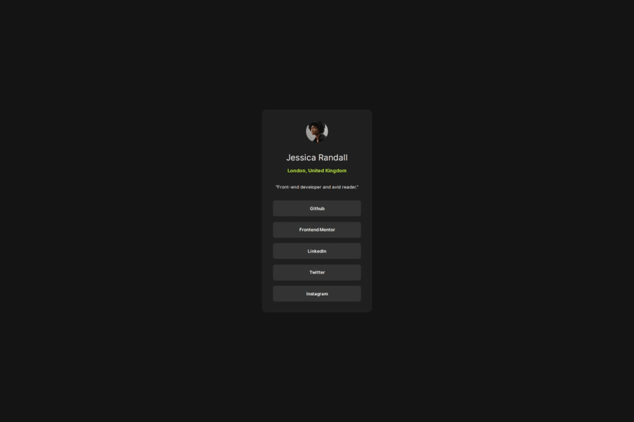


Design comparison

Solution retrospective
I am most proud of using proper BEM formatting when styling my SCSS styling. I think this helps keep my CSS readable for another user.
What challenges did you encounter, and how did you overcome them?One of the main challenges was learning how to properly do the margins and use the box model correctly. I was able to overcome them by understanding the difference between content, padding, border, and margin correctly.
What specific areas of your project would you like help with?Because the nature of this design is rather narrow it already works well on smaller phone screens. I would like feedback on the responsiveness of the design. Do we always need to use media queries? Or for a design like this is it okay to design it such that it works on the smallest screens first, and then progressively gets bigger?
Community feedback
- P@markobrien7Posted about 2 months ago
The solution looks really good to me. It was my first project using SAAS so it was good to see you are using it too. The only thing I can think of is design rules say most pages should have an h1 then the next h tag should be h2 then h3 etc. You shouldn't jump from an h3 to an h6. I think this is beneficial to screen readers.
In regards to your question about responsiveness, the design for this between the different screen sizes is only a slight adjustment to the width so I think its ok not to have media queries for this particular challenge. I think it would be different if on the larger screens the buttons were horizontal and then they changed to vertical at a smaller screen size.
Well done. Keep up the good work!
0

Please log in to post a comment
Log in with GitHub
Join our Discord community
Join thousands of Frontend Mentor community members taking the challenges, sharing resources, helping each other, and chatting about all things front-end!
Join our Discord