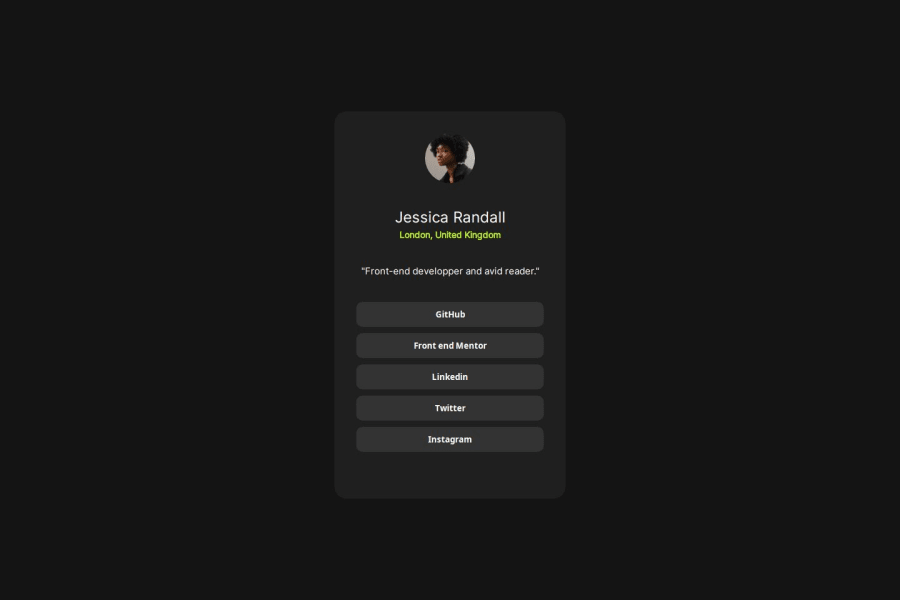
Design comparison
Solution retrospective
i used flex box and grid in the same time my only probleme was to set width and the height of the card and the second difficultie was the fonts weights but np i loved this challenge again it was fun and chilling
Community feedback
- P@danielmrz-devPosted about 1 year ago
Hello @Zenosaki!
Your solution looks great!
I have a couple of suggestions (about semantic HTML) for improvement:
📌 First: Use
<main>to wrap the main content instead of<div>.Think of
<div>and<span>in HTML like plain boxes or placeholders. They're handy for holding content, but they don't tell us anything about what's inside or what it's meant for on the webpage.📌 Second: Use
<h1>to<h6>for titles instead of<div>.Unlike what most people think, it's not just about the size and weight of the text.
- The
<h1>to<h6>tags are used to define HTML headings. <h1>defines the most important heading.<h6>defines the least important heading.- Only use one
<h1>per page - this should represent the main heading/title for the whole page. And don't skip heading levels - start with<h1>, then use<h2>, and so on.
All these tag changes may have little or any visual impact but they make your HTML code more semantic and improve SEO optimization as well as the accessibility of your project.
I hope it helps!
Other than that, great job!
Marked as helpful0@ZenosakiPosted about 1 year ago@danielmrz-dev thank you for the advice and i will try to do my best to improve my html code and again thank you so much
1 - The
- @Ezekiel225Posted about 1 year ago
Hello there 👋 @Zenosaki
Good job on completing the challenge !
Your project looks really good!
I have a suggestion about your code that might interest you.
There is an very useful browser extension called Perfect Pixel that allow you compare with the design image and thus see the exact dimensions. I recommend it to you.
I hope this suggestion is useful for future projects.
Keep up the excellent work and continue to challenge yourself with new projects. Your progress is impressive, and each project is a step forward in your front-end development journey! 🚀🌟.
Other than that, great job!
Happy coding.
Marked as helpful0@ZenosakiPosted about 1 year ago@Ezekiel225 i was waiting for that, thank you a lot that will save for me a lot of time , i hope i will be better next time
0
Please log in to post a comment
Log in with GitHubJoin our Discord community
Join thousands of Frontend Mentor community members taking the challenges, sharing resources, helping each other, and chatting about all things front-end!
Join our Discord
