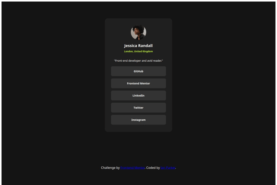
Design comparison
Solution retrospective
Glad to be getting more comfortable with CSS and using variables to make it a bit cleaner. I'm proud that the design looks correct and also being able to add some simple transition animation for a nice effect.
What challenges did you encounter, and how did you overcome them?No real challenges on this solution. If anything just still getting quicker working with flex boxes and using margins and padding to achieve the correct layout and sizing of elements.
What specific areas of your project would you like help with?Still having trouble sometimes and taking a while to get the layout exact. In my ".card" class in the stylesheet, lines 73-83 I had to specify the padding-inline, padding-top and padding-bottom to get the padding correct. I wanted to just use the shorthand "padding" but it would make the top and bottom padding bigger than the sides each time I tried. I am unsure why, and where the extra padding on the top and bottom was coming from.
I also would greatly appreciate any feedback particularly on the CSS, whether variables have been used effectively and what can be improved.
Please log in to post a comment
Log in with GitHubCommunity feedback
No feedback yet. Be the first to give feedback on Ian Parker's solution.
Join our Discord community
Join thousands of Frontend Mentor community members taking the challenges, sharing resources, helping each other, and chatting about all things front-end!
Join our Discord
