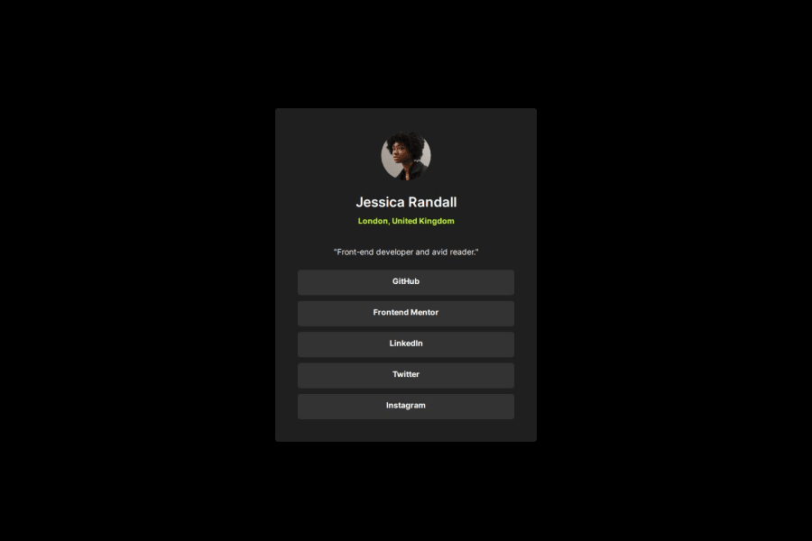
Design comparison
Solution retrospective
Getting familiar and able to apply flexbox in a project. Projects that I have worked on uses the old ways of structuring a div. In my upcoming projects will incorporate flexbox instead as it is easy to use.
What challenges did you encounter, and how did you overcome them?Applying the correct margins and sizes. Also had slight roadblocks in centering items in the body. It would be easier if I were to have a figma access for this project. But was able to solve my problems using the dev tools in chrome.
What specific areas of your project would you like help with?I would like to have suggestions on how do I enhance my html and css structure in the project. I have been a backend developer mostly in my career and I want to refresh my knowledge with my frontend development.
Community feedback
Please log in to post a comment
Log in with GitHubJoin our Discord community
Join thousands of Frontend Mentor community members taking the challenges, sharing resources, helping each other, and chatting about all things front-end!
Join our Discord
