Submitted 11 months ago
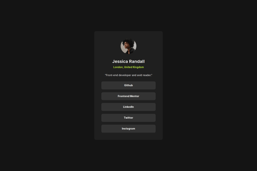
Social links profile - no media queries
#react#vite#styled-components

@alkersan

Design comparison
SolutionDesign

Solution retrospective
What are you most proud of, and what would you do differently next time?
After 3 or 4 previous attempts with similar exercises, laying out the components becomes more intuitive:
- avoid explicit widths on blocks, only set the maximums for the containing blocks (in rem)
- except for images and pictures - fixed width is ok
- the rest of the content should grow & shrink as they please
- centering is simpler to do with flex, rather than with grid's place-content. Flex will allow contents to grow if needed
- don't overuse the semantic blocks within components, as those are mostly for higher level layouts
Community feedback
Please log in to post a comment
Log in with GitHub
Join our Discord community
Join thousands of Frontend Mentor community members taking the challenges, sharing resources, helping each other, and chatting about all things front-end!
Join our Discord