

Design comparison

Solution retrospective
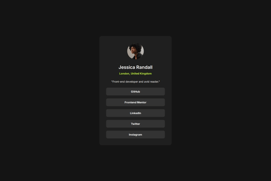
I tried my hardest to make this look as close to the design as possible!
What challenges did you encounter, and how did you overcome them?I encountered a bunch of challenges I don't specifically remember what exactly but they led me to learn about CSS media queries and pseudo selectors which is how I was able to get the desired responsiveness and made sure the element sizes were matching up correctly.
Community feedback
- @user2830581Posted about 2 months ago
Hey your solution looks great and is close to the design! Just a note on your HTML - you wrapped a lot of elements in
<div>tags. Although it technically works, it's not semantic HTML and can make it harder for others to read and understand your code.There are specific tags you could've used here like a
<nav>tag to group the navigation links, and instead of wrapping each link in a<div>and a<p>tag you could instead use<ul>and<li>tags. As I said it helps people read and understand your code but also helps with accessibility and screen readers. Try not to overuse<div>tags in the future other than that it looks good :)Marked as helpful1P@YeatisNeatPosted about 2 months ago@user2830581 Haha, you're right! I should stop using div too much. I've been using it for literally everything!
0@user2830581Posted about 2 months ago@YeatisNeat no worries it's easy to do I have to stop myself from doing the same!
1 - P@andreasdahlgren78Posted about 2 months ago
Congrats on finishing this project!
I cant see anything that I would have done any better to finish the project.
1P@YeatisNeatPosted about 2 months ago@andreasdahlgren78 Thank you very much for the encouragement!!
0


Please log in to post a comment
Log in with GitHubJoin our Discord community
Join thousands of Frontend Mentor community members taking the challenges, sharing resources, helping each other, and chatting about all things front-end!
Join our Discord