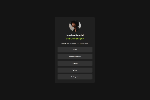
Design comparison
Solution retrospective
..
What challenges did you encounter, and how did you overcome them?..
What specific areas of your project would you like help with?I am not really sure what the issue is, but i cant seem to update the size of my wrapper (I.E the container) without explicitly adding a fixed width.
I have designed it with mobile first approach, thus after i was done with my mobile design, when I tried to make the size of the wrapper increase on larger screen sizes, using like max-width
but it didn't have any effect on it.
At the end, i forcibly updated the width with a media-query to get at least a brute-force solution, so if someone can help/guide me into resolving this issue, I'd very grateful.
Community feedback
- @grace-snowPosted 17 days ago
This doesn't need any media queries, just a width 100% and single max width in rem will be fine.
There is one severe accessibility problem in this solution I can see. You must never set font size in viewport units. That's really important and includes when inside a clamp value. Make sure it always converts to rem by combining that viewport value with a rem value. The utopia site has good examples of this if you look that up.
This challenge doesn't actually need any clamped font sizes though so it would be even simpler if you kept all font sizes static.
My other recommendation for this challenge is to have the list of links in a list.
Marked as helpful1@frost3dWavePosted 17 days ago@grace-snow yes, as I said in the solution retrospective, the only reason I added the media queries was that I couldn't get the width to adjust itself / increase on larger screens with max-width set. I then resolved it with the help of someone from discord, so when I updated the solution, I removed the media queries.
As for the vw units, I keep it in mind & will check out the site. Thank you very much for the recommendation.
As for the last point, is there like a checklist of when I should use of certain elements more than others, because when I first looked at the challenge & even when I was solving it, I didn't really think to use
ul
here, & now that you mention it here, it does make sense to use it here. How should I be deciding/choose which elements would be ideal..? Or does that come with experience.?And once again, thank you very much for the feedback. I appreciate it a ton!
0@grace-snowPosted 14 days ago@frost3dWave With lists, they can definitely be over-used. And it's not essential in this case, but I think makes a lot of sense. The added benefit to screen reader users is they will know how many items there are.
Choosing appropriate meaningful elements definitely improves with practice. But it needs to be given proper attention / intentionality for that to happen. I.e. The more you pause and consider what elements should be used for each bit of content the more that skill will improve.
(The font size in viewport units is a very serious issue though - that one is essential to fix).
Marked as helpful0@frost3dWavePosted 14 days ago@grace-snow yes, I have fixed the vw units for fonts & thank you for your insights!
0 - @abdulkadir023Posted 18 days ago
- Good solution but you can make some improvements on the (card padding, margin)
- Maybe add some urls to the links so that the links are working correctly and moreso, make them responsive.
-About your question maybe you can check this out if it solves your problem : https://www.sitepoint.com/community/t/wrapper-not-extending-with-child-div-elements/243982
Marked as helpful1@frost3dWavePosted 17 days ago@abdulkadir023 ah! i see what you mean. I have updated it.. Thank you for the feedback, i appreciate it.
0
Please log in to post a comment
Log in with GitHubJoin our Discord community
Join thousands of Frontend Mentor community members taking the challenges, sharing resources, helping each other, and chatting about all things front-end!
Join our Discord