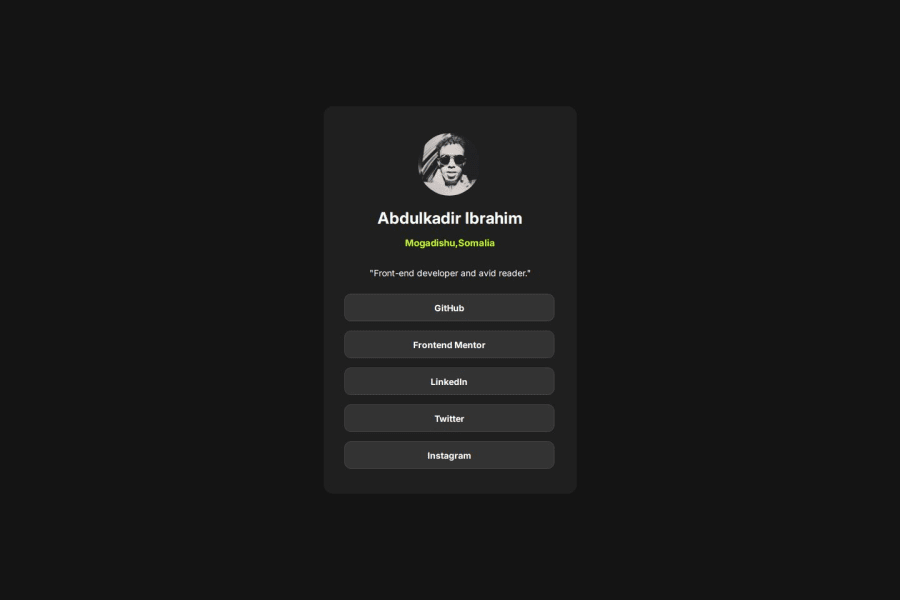
Design comparison
Solution retrospective
I'm proud of completing this project because i had ups and downs and had to learn few things on the way to complete the project. I would say there is no easy way and you have to do the work, So i wouldn't regret starting the project again and going the same route which is doing the challenge and learning new and better ways to tackle certain problems.
What challenges did you encounter, and how did you overcome them?I had quite few challenges here and there simply because you cannot remember everything that you learn so, I overcame all the challenges by researching and looking for similar questions that i had and were posted in stack overflow.
What specific areas of your project would you like help with?I would say for now I'm good but in the future i might need some help and will surely ask in the discord channel.
Please log in to post a comment
Log in with GitHubCommunity feedback
- @grace-snow
So there are some important principles to learn from these early challenges. I'm afraid a lot of this will need rewriting. Work through the feedback carefully and take time to understand. You will probably need to go back through earlier challenges and apply the same learnings.
- All content should be contained within landmarks.Everything in this design belongs in a
mainlandmark. (What you have as a div with the classcontainer). - The image, name heading and paragraph are not links! Where do you think those would even go to? I've no idea what the intention was there, but these are definitely static page content and not links.
- The image is decorative in my opinion so should have an empty
altattribute. If you think the image is providing valueable/meaningful content, then the alt description would need to properly describe the image. - The top half of the card doesn't need wrapping in a div. Keep the HTML as simple as possible. All extra wrappers do is make the styling harder for no benefit.
- I'd expect the list of links to be in an actual list.
- You don't need paragraphs inside the links.
- Always use a full modern CSS reset at the start of the styles in every project. Andy Bell or Josh Comeau both have good ones. Look them up and use one every time.
- Content is currently being badly cut off at some screen sizes (like smaller devices, especially in landscape view). This is because you have limited the container height to 100vh. Never limit the height of any elements that contain text anywhere within them. Instead, use min-height so the browser is allowed to extend that element when it needs to.
- I think you're getting confused about when to use padding and margin. This article should help: https://fedmentor.dev/posts/padding-margin/ . The main and card should both have padding. Everything within that card should only need vertical margins. The links will need padding on all sides. The image can have margin auto to center it, not an explicit margin in px.
- Nothing except the image should have a width or height in this. This is a very important principle to understand. It's the browser's job to decide what height things need to be based off the content inside them and any internal spacings.
- Instead of width on the card, use max-width in rem (it can optionally be width 100% as well). This lets it shrink narrower when it needs to and using rem means the layout will scale for all users, even those with different font-size settings in their browser or device.
- There is no need for a media query in this challenge.
- Remember, it is the links that need styling, including hover. Not their wrapping elements. Keep it simple.
- You can use flex properties to center the text in the links.
- You can set text-align center on the whole card component and it will be inherited by the child elements.
- Font size should never be in px. Use rem. https://fedmentor.dev/posts/font-size-px/
- All content should be contained within landmarks.Everything in this design belongs in a
Join our Discord community
Join thousands of Frontend Mentor community members taking the challenges, sharing resources, helping each other, and chatting about all things front-end!
Join our Discord
