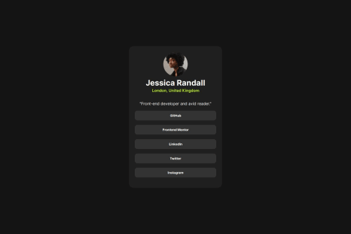
Submitted over 1 year agoA solution to the Social links profile challenge
social links profile main using flexbox
@alphajoeofoe

Solution retrospective
What are you most proud of, and what would you do differently next time?
i was able to resize stuff and experiment with padding and margins
What challenges did you encounter, and how did you overcome them?im still not able to do the responsive part like for mobile and desktop
What specific areas of your project would you like help with?Feedback if possible on the how to use @media for responsiveness for the mobile view of it
Code
Loading...
Please log in to post a comment
Log in with GitHubCommunity feedback
No feedback yet. Be the first to give feedback on alphajoeofoe's solution.
Join our Discord community
Join thousands of Frontend Mentor community members taking the challenges, sharing resources, helping each other, and chatting about all things front-end!
Join our Discord