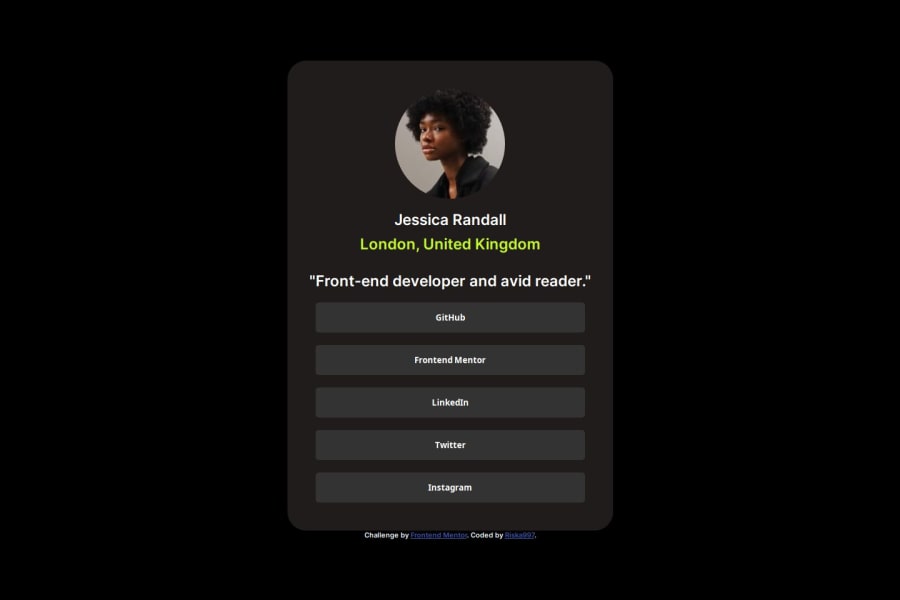
Design comparison
Solution retrospective
I am proud to have completed this project. Next time, I would like to use CSS Grid and explore float properties.
What challenges did you encounter, and how did you overcome them?The challenge I encountered was incorrectly referring the parent elements to each child element. I overcame this by carefully reviewing the HTML structure and ensuring each parent-child relationship was properly defined.
What specific areas of your project would you like help with?Flexbox and Grid Layouts
-
While I used Flexbox for the layout, I am interested in understanding how I could have implemented CSS Grid for the same purpose.
-
Can someone provide a comparison or example of how to convert my Flexbox layout to a Grid layout?
Best Practices
-
Any advice on best practices for organizing and structuring my HTML and CSS files would be helpful.
-
For example, should I separate certain styles into different files or use specific naming conventions?
Any other feedback is welcome!
Community feedback
- @shuamaminePosted 10 months ago
Hey! good job on making this site
I would like to give some feedback of my own so it can help you improve---
-
for class intro, you can
.intro { display: flex; flex-direction: column; justify-content: center; align-items: center; } -
font-weight for buttons can be made 600 to stick as close to the design as possible
-
increase padding for container class
Happy Coding!
Marked as helpful1 -
Please log in to post a comment
Log in with GitHubJoin our Discord community
Join thousands of Frontend Mentor community members taking the challenges, sharing resources, helping each other, and chatting about all things front-end!
Join our Discord
