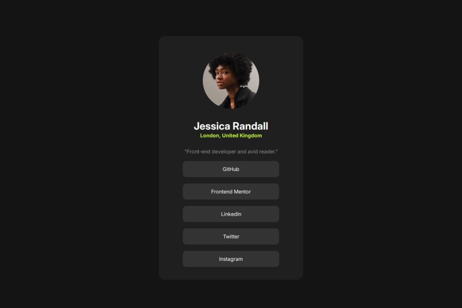
Design comparison
Community feedback
- @AdrianoEscarabotePosted 5 months ago
Hello m-taaha, how are you? I was really pleased with your project, but I’d like to offer some advice that might help:
I noticed that you used a button in which case the best option would be an a, because in my head when a person clicks on a button written
Learn More, he is not confirming a form, or something like, it will be redirected to another page, to Learn More about!to solve this problem do this:
<a href="/">Learn More</a>The rest is spot on.
Hope it’s helpful to you. 👍
Marked as helpful0@m-taahaPosted 5 months ago@AdrianoEscarabote thanks a lot! sir I will keep in mind. it is very helpful to me
1 - @ajasmine94Posted 5 months ago
Hi! I saw how you were able to come up with the solution and it's great that you're close to the original as well :) Something I want to point out is the usage of width: 100% and fixed height on your #card section and I recently learned how that is not very advisable and would be better to use 100vh (viewport height) instead.
Marked as helpful0@m-taahaPosted 5 months ago@ajasmine94 I am very thankful for you advice . Thank you for you guidance.
0
Please log in to post a comment
Log in with GitHubJoin our Discord community
Join thousands of Frontend Mentor community members taking the challenges, sharing resources, helping each other, and chatting about all things front-end!
Join our Discord
