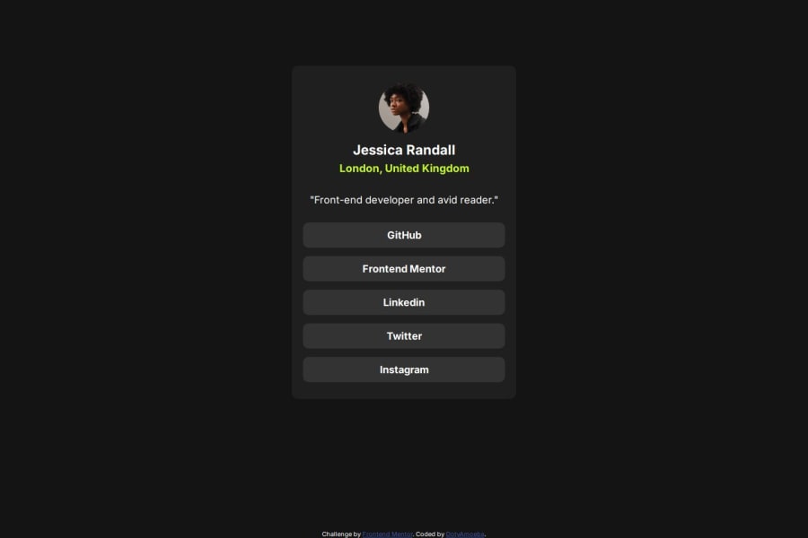


Design comparison
SolutionDesign

Solution retrospective
What are you most proud of, and what would you do differently next time?
I'm proud of the CSS code as it was the hardest part I've overcome
What challenges did you encounter, and how did you overcome them?The main difficulty is adaptation
What specific areas of your project would you like help with?I want to hear your opinion about my css code
Community feedback
- @kankaGatePosted 3 months ago
Great solution! Please allow me to give some feedback:
- on hover & focus state, the color font should be dark grey
- use semantic html like main containing the main area of the page, instead of straight to div. this will help the screen reader works better
- reset css code on padding, margin and box-sizing on the same block of code, for example on body, html or * selector
- use responsive unit measurement such as em, rem, % instead of px
- your responsive block of code is covering most of the elements, congratulations!
have a nice day!
Marked as helpful0 - @dave-tegPosted 3 months ago
Hi there. Good job finishing the challenge. But I think the solution is a bit different from the design. I think the margin-top from the attribution class is pushing the card up which cause distortion from the design. But the rest seems good.
1


Please log in to post a comment
Log in with GitHubJoin our Discord community
Join thousands of Frontend Mentor community members taking the challenges, sharing resources, helping each other, and chatting about all things front-end!
Join our Discord